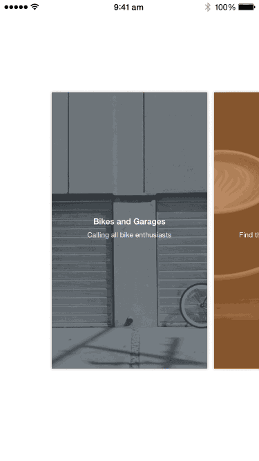
Goal
We are going to recreate the sliding panels effect from Rooms by Facebook. The final result looks something like this:
Observations
There is a row of rooms.
These views contain a background image and some text, each of them are, in essence, a (chat) room. The views are arranged in a horizontal linear row.
Scrolling comes to a stop when a room is in the center.
No matter how you scroll, we end on where one of the rooms stop in the center of the screen. There could possibly be rooms hanging off the left and right which tell you if there's more (for scrolling purposes.)
The room transitions into view when tapped.
When tapped, a few things happen quickly. Firstly, the background scales to fit the screen. The image fades away and the text move upward into what looks like the navigation bar. And you might have missed this, but behind the growing view, the view controller in the background fades darker in a transparent black overlay. Since this transition doesn't really look like a navigation controller transition, it's likely to be just a custom modal transition.
Prerequisites
This teardown requires Xcode 6 and above and resulting project works on iOS 8 and above. You should also know the following concepts:
Xcode Basics
You should know your way around Xcode including how to create projects and classes, and access files, navigators and inspectors. You should also know how to create outlets and actions in interface builder (check out the previous teardown if you don't already know this.)
UIKit Basics
You should know how to create views (in code and in Interface Builder) as well as how to manipulate properties on UIView and its subclasses. You should also know how to use Auto Layout.
Game Plan
We'll configure a UICollectionView to display the row of rooms. Next we'll add the custom scrolling behavior and lastly, we'll create a modal transition that performs the scaling effect.
Blueprint
Setting up the Collection View
Start a new Xcode project with the Single View Application template. Go into Main.storyboard and remove the default view controller (click on it and press delete.)
Drag the Collection View Controller from the Object Library onto the storyboard. We're using a collection view because we can represent each room as a collection view cell.
We can't use a table view because each cell is positioned as an entire row.
UICollectionViewis ideal for this scenario.
Next, we will change the collection view's background color to white in the Attributes Inspector. Set the Scroll Direction of the collection view to Horizontal. And for now give the collection view cell a background color and set its identifier in the Attributes Inspector to Cell.
Let's subclass UICollectionViewController to house the logic for this screen. Create a new file RoomsViewController and set it as the custom class in the storyboard. Also ensure Is Initial View Controller is checked in the Attributes Inspector.
Because we're registering the collection view cell implicity via the storyboard, remove any registration placeholder code in viewDidLoad().
Next remove the numberOfSectionsInCollectionView() method or have it return 1 (which is the default.) For now, we'll have the collection view show 3 cells. This is will make it easier when we try to customize the layout and behavior.
override func collectionView(collectionView: UICollectionView, numberOfItemsInSection section: Int) -> Int {
    return 3
}
Finally, we'll supply a default implementation for cellForItemAtIndexPath:
override func collectionView(collectionView: UICollectionView, cellForItemAtIndexPath indexPath: NSIndexPath) -> UICollectionViewCell {
    let cell = collectionView.dequeueReusableCellWithReuseIdentifier("Cell", forIndexPath: indexPath) as UICollectionViewCell
    return cell
}
The reuse identifer
Cellshould match the value we specified for the cell in the storyboard.
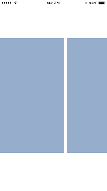
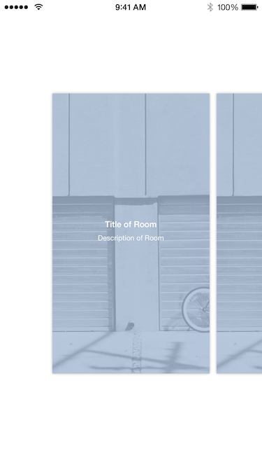
Build and run and you should see the following:
Next we configure the cell size as well as provide some padding on the left and right so the first and last cells come to rest in the center of the screen.
We want the cell size to be proportional to the screen size so that the effect of the transition later on looks better. Add the following constant to the top of the file:
let kRoomCellScaling: CGFloat = 0.6
Next add the method setupCollectionView() to the RoomsViewController so we can configure the collection view:
func setupCollectionView() {
    let screenSize = UIScreen.mainScreen().bounds.size
    let cellWidth = floor(screenSize.width * kRoomCellScaling)
    let cellHeight = floor(screenSize.height * kRoomCellScaling)
}
What we've done here is just to calculate some values we'd like for the width and height of the cells in the collection view. Next we'll calculate how much padding to inset the contents of the collection view on the left, top, bottom and right so we get the cells in the center:
func setupCollectionView() {
    ...

    let insetX = (CGRectGetWidth(view.bounds)-cellWidth) / 2.0
    let insetY = (CGRectGetHeight(view.bounds)-cellHeight) / 2.0
}
Finally we need to set these values as parameters on the itemSize property on the layout object and contentInset on the collection view respectively.
func setupCollectionView() {
    ...

    let layout = collectionView.collectionViewLayout as UICollectionViewFlowLayout
    layout.itemSize = CGSize(width: cellWidth, height: cellHeight)

    collectionView.contentInset = UIEdgeInsets(top: insetY, left: insetX, bottom: insetY, right: insetX)
    collectionView.reloadData()
}
We finish by telling the collection view to reload so the new parameters take effect. Call this method in viewDidLoad() to configure the collection view when the view controller is loaded:
override func viewDidLoad() {
    super.viewDidLoad()
    setupCollectionView()
}
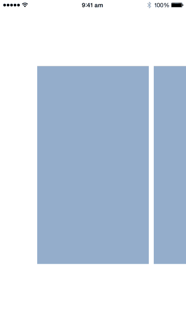
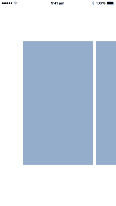
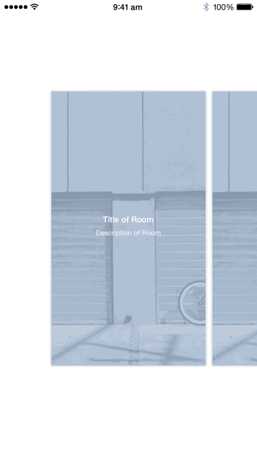
Build and run and you should see the following:
If you've noticed we can stop scrolling at any arbitrary position within the content. What'd we like is to have the collection view stop scrolling and position one of the cells in the center of the screen.
To do this we'll supply a method from UIScrollViewDelegate called scrollViewWillEndDragging(scrollView:withVelocity:targetContentOffset:). By providing a target contentOffset, we'll tell the collection view (which is a UIScrollView subclass) where exactly it should stop.
Now suppose we wanted cells to always be flushed with the left edge (ignoring the contentInset we currently have to center cells), we need to ensure the content offset is a strict multiple of the cell width (including the space between cells). We calculate what this multiple would be for an arbitrary scroll position, then round this number to the closest integer value. Next we work backwards and determine the ideal (or target) content offset. (See the diagram below for a visualization.)
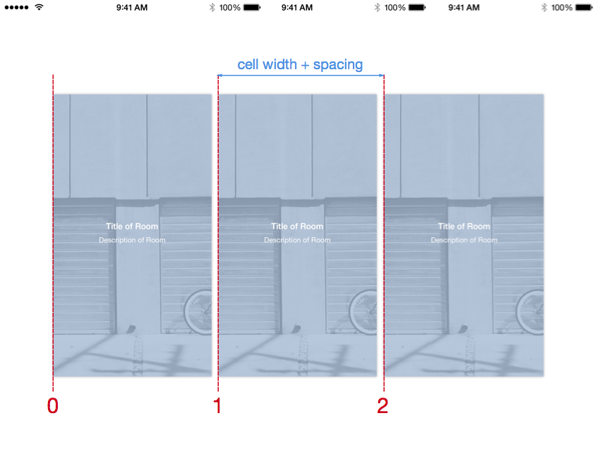
To perform the above calculations, we first retrieve the cell width and spacing from the collection view layout object. Here's what the method looks like:
// MARK: UIScrollViewDelegate

override func scrollViewWillEndDragging(scrollView: UIScrollView, withVelocity velocity: CGPoint, targetContentOffset: UnsafeMutablePointer<CGPoint>) {
    let layout = collectionView.collectionViewLayout as UICollectionViewFlowLayout
    let cellWidthIncludingSpacing = layout.itemSize.width + layout.minimumLineSpacing

    var offset = targetContentOffset.memory

    let index = (offset.x + scrollView.contentInset.left) / cellWidthIncludingSpacing
    let roundedIndex = round(index)

    offset = CGPoint(x: roundedIndex*cellWidthIncludingSpacing - scrollView.contentInset.left, y: -scrollView.contentInset.top)
    targetContentOffset.memory = offset
}
Notice before our calculations, we add the content inset to the content offset (because we can see more to the left as a result of the inset.) After we calculate the content offset, we have to subtract away the required inset.
We're using
minimumLineSpacinginstead ofminimumInteritemSpacingbecause our collection view scrolls in the horizontal, not vertical, direction.
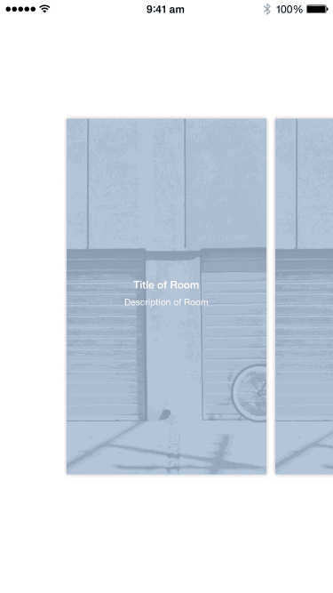
Build and run and you should see the following:
Building the Detail View
Next we'll build the detail view controller that shows up after the transition. There's a few things to note. Firstly the primary content can be swiped down to reveal secondary information (in the actual app this includes the invite button.) As this happens the labels also move around and the background image fades in. This is basically the reverse of what happens during our transition so we will want to make a UIView subclass to contain these elements so we can reuse it in the collection view cells later.
To do this, we'll create a UIViewController subclass, DetailViewController. We'll also add a UIView subclass DetailView to our project.
Next add a new view controller in the storyboard. Drag a view into this controller and setup the custom class in the Attributes Inspector to the above subclasses.
To this class we'll add an image view for the background, an overlay view that we'll use to apply a tint color over the image view, the title label and the subtitle label. We will add these views as properties to the DetailView:
let imageView: UIImageView = {
    let imageView = UIImageView()
    imageView.contentMode = .ScaleAspectFill
    return imageView
    }()

let overlayView: UIView = {
    let view = UIView()
    view.backgroundColor = UIColor(red: 0.655, green: 0.737, blue: 0.835, alpha: 0.8)
    return view
}()

let titleLabel: UILabel = {
    let label = UILabel()
    label.font = UIFont.boldSystemFontOfSize(20)
    label.textColor = UIColor.whiteColor()
    label.textAlignment = .Center
    return label
    }()

let subtitleLabel: UILabel = {
    let label = UILabel()
    label.font = UIFont.systemFontOfSize(17)
    label.textColor = UIColor.whiteColor()
    label.textAlignment = .Center
    label.numberOfLines = 0
    return label
    }()
We've used Computed Properties. This Swift feature let's us configure the views directly when the views are lazily instantiated.
This detail view should be able to present its contents in between 2 states. One where the labels are aligned to the top and another where they are centered. We'll first add a property to encapsulate this idea:
var transitionProgress: CGFloat = 0 {
    didSet {
        updateViews()
    }
}
When the value is 0 the labels would be at the top and when the value is 1, the labels would be centered. Of course we will want the property to take values between 0 and 1. Let's now add a method to configure the labels:
func updateViews() {
    let progress = min(max(transitionProgress, 0), 1)
    let antiProgress = 1.0 - progress

    let titleLabelOffsetTop: CGFloat = 20.0
    let titleLabelOffsetMiddle: CGFloat = bounds.height/2 - 44
    let titleLabelOffset = transitionProgress * titleLabelOffsetMiddle + antiProgress * titleLabelOffsetTop

    let subtitleLabelOffsetTop: CGFloat = 64
    let subtitleLabelOffsetMiddle: CGFloat = bounds.height/2
    let subtitleLabelOffset = transitionProgress * subtitleLabelOffsetMiddle + antiProgress * subtitleLabelOffsetTop

    titleLabel.frame = CGRect(x: 0, y: titleLabelOffset, width: bounds.width, height: 44)
    subtitleLabel.preferredMaxLayoutWidth = bounds.width
    subtitleLabel.frame = CGRect(x: 0, y: subtitleLabelOffset, width: bounds.width, height: subtitleLabel.font.lineHeight)

    imageView.alpha = progress
}
This bit requires some math. For each label, we define an offset value for the top and centered state respectively. Then depending on the transitionProgress value, we compute a value in between these two states using a simple weighted average formula. Finally we want the image view to fade according to the progress value.
Next we'll add the method to configure these views and add them to our view hierarchy:
func setup() {
addSubview(imageView)
addSubview(overlayView)
addSubview(titleLabel)
addSubview(subtitleLabel)
clipsToBounds = true
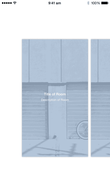
titleLabel.text = "Title of Room"
subtitleLabel.text = "Description of Room"
imageView.image = UIImage(named: "bicycle-garage-gray")
}
We're telling the detail view to clip its bounds. In case our background image is too large, any region falling outside the view is hidden.
We want the setup method to get called when the view is loaded. If created programmatically, the best place to do this is in the initializer init(frame:). If the view is unarchived from a storyboard or nib file, we should use awakeFromNib().
We can support both uses by overriding both methods:
override init(frame: CGRect) {
    super.init(frame: frame)
    setup()
}

required init(coder aDecoder: NSCoder) {
    super.init(coder: aDecoder)
}

override func awakeFromNib() {
    super.awakeFromNib()
    setup()
}
We also overrode
init(coder:)because in Swift, we're required to provide an implementation forinit(coder:)if we override any initializers inUIView.
We'll also override layoutSubviews(). This is the method that's called when UIView needs to update its view hierarchy:
override func layoutSubviews() {
    super.layoutSubviews()

    imageView.frame = bounds
    overlayView.frame = bounds
    updateViews()
}
We're simply just stretching the image view and overlay view to cover the entire region of the view.
We can get a quick preview of this by add the IBDesignable attribute to our class:
@IBDesignable class DetailView: UIView {
}
We'll also supply the method prepareForInterfaceBuilder() so that our setup() method can get called:
override func prepareForInterfaceBuilder() {
    super.prepareForInterfaceBuilder()
    setup()
}
Go into the storyboard and see that the view now display our labels and overlay color. The image view does not seem to display in interface builder at the point of writing.
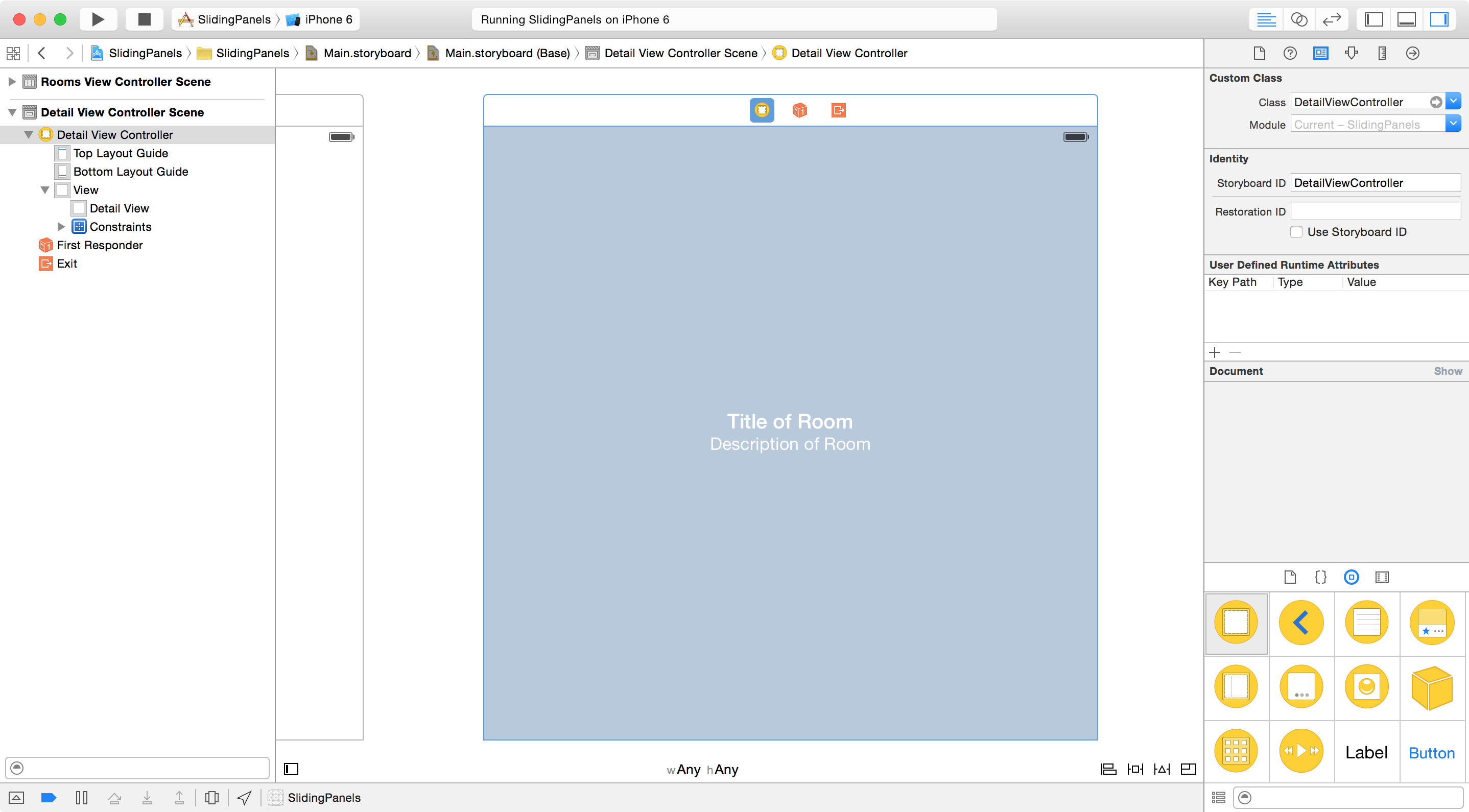
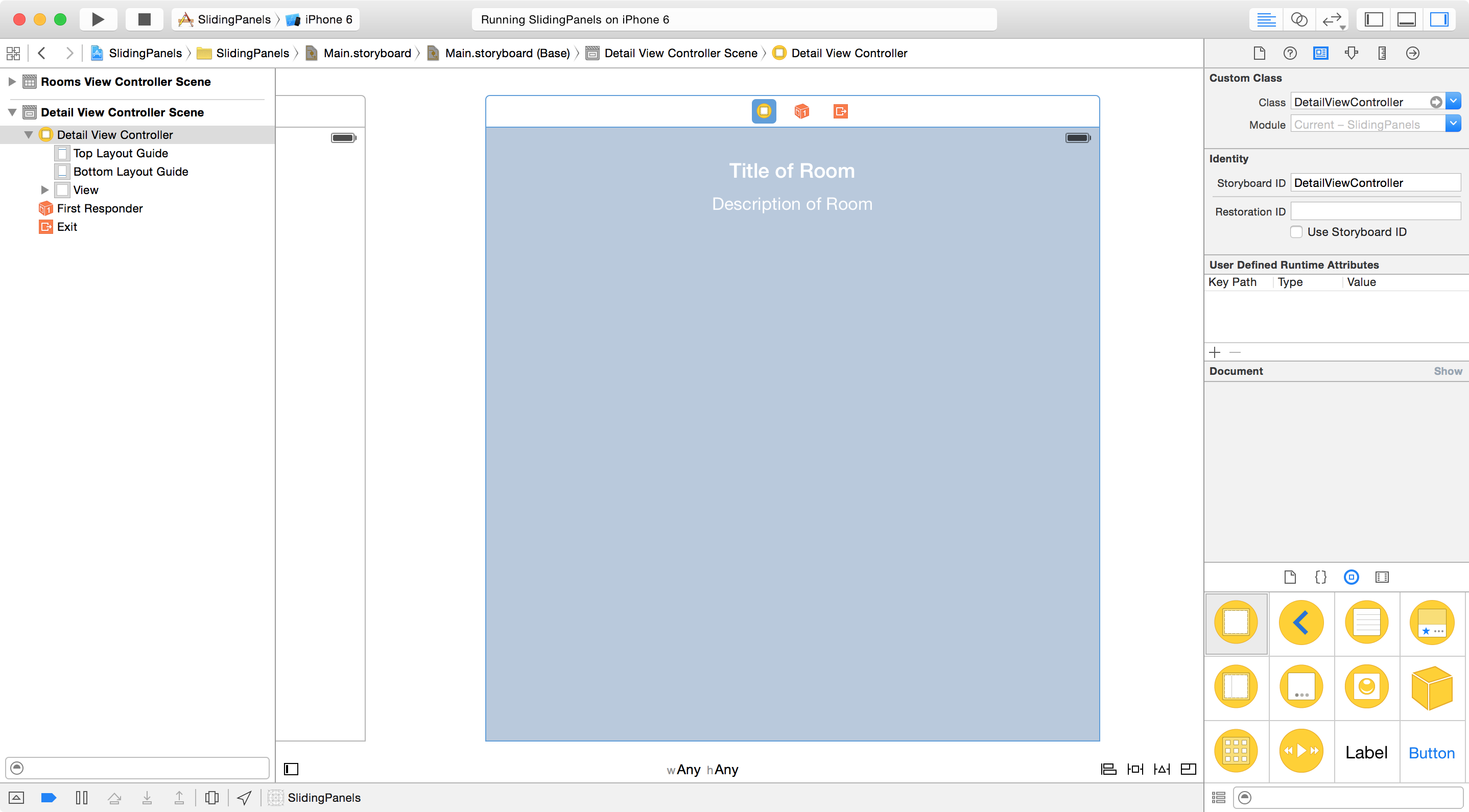
If you now change the initial value of our transitionProgress property, you can see the appearance of the detail view update in the storyboard (Undo this change for later):
var transitionProgress: CGFloat = 1 {
    ...
}
Let's add a Storyboard ID to the view controller, DetailViewController so we can instantiate this view controller later on.
Now in RoomsViewController add the method to present this view controller:
// MARK: UICollectionViewDelegate

override func collectionView(collectionView: UICollectionView, didSelectItemAtIndexPath indexPath: NSIndexPath) {
    let controller = UIStoryboard(name: "Main", bundle: nil).instantiateViewControllerWithIdentifier("DetailViewController") as UIViewController
    presentViewController(controller, animated: true, completion: nil)
}
We'll add a content view to the DetailViewController to later display whatever contents in appropriate:
let contentView = UIView()
Place the following constants at the top of the file:
private let kContentViewTopOffset: CGFloat = 64
private let kContentViewBottomOffset: CGFloat = 64
private let kContentViewAnimationDuration: NSTimeInterval = 1.4
In viewDidLoad() we need to add the content view to the view hierarchy. We'll also add a small shadow around the content view using its layer property:
override func viewDidLoad() {
    super.viewDidLoad()

    contentView.backgroundColor = UIColor.whiteColor()
    contentView.frame = CGRect(x: 0, y: kContentViewTopOffset, width: view.bounds.width, height: view.bounds.height-kContentViewTopOffset)
    contentView.layer.shadowRadius = 5
    contentView.layer.shadowOpacity = 0.3
    contentView.layer.shadowOffset = CGSizeZero

    view.addSubview(contentView)
}
Next we'll add a pan gesture to move the content view around. We need to supply the method that will called when the gesture is recognized. When the pan gesture is active, we need to move the content view by the amount panned (in the vertical direction). When the panning stops, we have to decide if we should bounce the content view upwards or downwards. We do this by computing progress the (fractional) amount that the user has moved the content view downward. By comparing progress to a threshold (of 0.5) we can animate the content view back to one of the two fixed positions.
func handlePan(pan: UIPanGestureRecognizer) {
    switch pan.state {
    case .Began:
        fallthrough
    case .Changed:
        contentView.frame.origin.y += pan.translationInView(view).y
        pan.setTranslation(CGPointZero, inView: view)

        let progress = (contentView.frame.origin.y - kContentViewTopOffset) / (view.bounds.height - kContentViewTopOffset - kContentViewBottomOffset)
        detailView.transitionProgress = progress

    case .Ended:
        fallthrough
    case .Cancelled:
        let progress = (contentView.frame.origin.y - kContentViewTopOffset) / (view.bounds.height - kContentViewTopOffset - kContentViewBottomOffset)
        if progress > 0.5 {
            let duration = NSTimeInterval(1-progress) * kContentViewAnimationDuration
            UIView.animateWithDuration(duration, delay: 0, usingSpringWithDamping: 0.7, initialSpringVelocity: 0, options: .allZeros, animations: { () -> Void in
                [self]

                self.detailView.transitionProgress = 1
                self.contentView.frame.origin.y = self.view.bounds.height - kContentViewBottomOffset

            }, completion: nil)
        }
        else {
            let duration = NSTimeInterval(progress) * kContentViewAnimationDuration
            UIView.animateWithDuration(duration, delay: 0, usingSpringWithDamping: 0.7, initialSpringVelocity: 0, options: .allZeros, animations: { () -> Void in
                [self]

                self.detailView.transitionProgress = 0
                self.contentView.frame.origin.y = kContentViewTopOffset

                }, completion: nil)
        }

    default:
        ()
    }
}
We'll compute a
durationvalue for the animation depending on how far away we are from the resting position to create a more dynamic looking animation.
Finally we need to add this pan gesture to the detail view controller:
override func viewDidLoad() {
    ...

    let pan = UIPanGestureRecognizer(target: self, action: "handlePan:")
    view.addGestureRecognizer(pan)
}
Adding a close button to the view controller and implementing the action is left as an exercise. (You can refer to the previous teardowns if you get stuck.) Build and run and you should see the following:
Implementing the Transition
We're almost ready to write our transition. But first add a subclass of UICollectionViewCell for the rooms in our RoomsViewController.
Here we'll create a DetailView and add it to our cell. As before we'll first overwrite the initializers:
class RoomCell: UICollectionViewCell {

    let detailView = DetailView(frame: CGRectZero)

    override init(frame: CGRect) {
        super.init(frame: frame)
        setup()
    }

    required init(coder aDecoder: NSCoder) {
        super.init(coder: aDecoder)
    }

    override func awakeFromNib() {
        super.awakeFromNib()
        setup()
    }

    func setup() {
        backgroundColor = UIColor.clearColor()
        contentView.addSubview(detailView)
        layer.shadowRadius = 2
        layer.shadowOpacity = 0.3
        layer.shadowOffset = CGSizeZero
        layer.masksToBounds = false
    }
}
For the layout, we first set the detail view to be the same dimensions as the screen. Next we determine the scale of the cell with respect to the screen and shrink our view by that amount. Finally we place the view in the center of the cell.
override func layoutSubviews() {
    super.layoutSubviews()

    let screenBounds = UIScreen.mainScreen().bounds
    let scale = bounds.width / screenBounds.width

    detailView.transitionProgress = 1
    detailView.frame = screenBounds
    detailView.transform = CGAffineTransformMakeScale(scale, scale)
    detailView.center = CGPoint(x: bounds.width/2, y: bounds.height/2)
}
We are assuming of course the cell is proportional to the screen size.
Build and run and you should see the following:
Now we are ready to finish with the custom transition. Create a new subclass of NSObject called PanelTransition. Let's have this class implement the UIViewControllerAnimatedTransitioning protocol in order to perform transitions.
class PanelTransition: NSObject, UIViewControllerAnimatedTransitioning {
    func transitionDuration(transitionContext: UIViewControllerContextTransitioning) -> NSTimeInterval {
        return 0.6
    }

    func animateTransition(transitionContext: UIViewControllerContextTransitioning) {
    }
}
Next, we also need a transitioningDelegate to supply the actual objects that perform the transition. For convenience, our transition object can also be a transitioningDelegate (unless you have to provide both than one custom transition per view controller).
Let's also keep track of some state while we're at it:
enum State {
    case None
    case Presenting
    case Dismissing
}

var state = State.None
Now let's add the methods required for UIViewControllerTransitioningDelegate:
class PanelTransition: NSObject, UIViewControllerAnimatedTransitioning, UIViewControllerTransitioningDelegate {
    ...

    func animationControllerForPresentedController(presented: UIViewController, presentingController presenting: UIViewController, sourceController source: UIViewController) -> UIViewControllerAnimatedTransitioning? {
        state = .Presenting
        return self
    }

    func animationControllerForDismissedController(dismissed: UIViewController) -> UIViewControllerAnimatedTransitioning? {
        state = .Dismissing
        return self
    }
}
Now we're ready to provide a basic boilerplate implementation of animateTransition():
func animateTransition(transitionContext: UIViewControllerContextTransitioning) {
    let duration = transitionDuration(transitionContext)

    let fromViewController = transitionContext.viewControllerForKey(UITransitionContextFromViewControllerKey)!
    let toViewController = transitionContext.viewControllerForKey(UITransitionContextToViewControllerKey)!
    let containerView = transitionContext.containerView()

    var backgroundViewController = fromViewController
    var foregroundViewController = toViewController
    if (state == .Dismissing) {
        backgroundViewController = toViewController
        foregroundViewController = fromViewController
    }

    containerView.addSubview(backgroundViewController.view)
    containerView.addSubview(foregroundViewController.view)

    if state == .Presenting {
        foregroundViewController.view.alpha = 0
    }
    else {
        foregroundViewController.view.alpha = 1
    }

    UIView.animateWithDuration(duration, delay: 0, options: .allZeros, animations: { () -> Void in
        [self]
        if self.state == .Presenting {
            foregroundViewController.view.alpha = 1
        }
        else {
            foregroundViewController.view.alpha = 0
        }

    }) { (finished) -> Void in
        transitionContext.completeTransition(!transitionContext.transitionWasCancelled())
    }
}
First we extract the fromViewController and toViewController parameters from the transitionContext. We use the state we stored earlier to determine which of these is in front of the other (i.e. which is the backgroundViewController and which is the foregroundViewController).
Next we add the views of the two view controllers to the container view (think of this as a sandbox where we can perform the animations.) We then fade the foreground view controller in or out as necessary. Finally we need to call the completeTransition() method on the transition context to tell the system that we're done.
Build and run and you should see the following:
Although the custom modal transition we want to create needs some knowledge of the view controllers involved, we need to ensure this knowledge is kept to a minimum (to avoid Tight Coupling). One way is to use Protocols.
Add this to the bottom of the transition object file:
@objc
protocol PanelTransitionViewController {
    func panelTransitionDetailViewForTransition(transition: PanelTransition) -> DetailView!
}
All the protocol says is that to participate on our transition, the view controllers need to have a DetailView somewhere in their view hierarchy and we would then know how to perform the animation.
We can then check the view controllers to see if they conform to the protocol (or implement the methods required by the protocol) to know if we are good for the transition or if we should fall back to the system transitions.
First add the following property to our transition object:
var presentingController: UIViewController!
We need to store away the presenting controller because on dismissal we don't have direct access to it.
Next update the following methods:
func animationControllerForPresentedController(presented: UIViewController, presentingController presenting: UIViewController, sourceController source: UIViewController) -> UIViewControllerAnimatedTransitioning? {
    presentingController = presenting
    if presented is PanelTransitionViewController &&
        presenting is PanelTransitionViewController {
            state = .Presenting
            return self
    }
    return nil
}

func animationControllerForDismissedController(dismissed: UIViewController) -> UIViewControllerAnimatedTransitioning? {
    if dismissed is PanelTransitionViewController &&
        presentingController is PanelTransitionViewController {
            state = .Dismissing
            return self
    }
    return nil
}
If you build and run now, you'll find that the system transition is used when you tap on the collection view cell. That's because we haven't implemented PanelTransitionViewController in our view controllers.
To implement the protocol in RoomsViewController, let's first add a property to it to keep track of the selected cell:
var selectedIndexPath: NSIndexPath?
We'll update this property when the cells are selected:
override func collectionView(collectionView: UICollectionView, didSelectItemAtIndexPath indexPath: NSIndexPath) {
    selectedIndexPath = indexPath

    ...
}
Now we're ready to implement method and return an instance of DetailView:
class RoomsViewController: UICollectionViewController, PanelTransitionViewController {
    ...
    // MARK: PanelTransitionViewController

    func panelTransitionDetailViewForTransition(transition: PanelTransition) -> DetailView! {
        if let indexPath = selectedIndexPath {
            if let cell = collectionView.cellForItemAtIndexPath(indexPath) as? RoomCell {
                return cell.detailView
            }
        }
        return nil
    }
}
In DetailViewController, this step is even more trivial:
class DetailViewController: UIViewController, PanelTransitionViewController {
    ...

    // MARK: PanelTransitionViewController

    func panelTransitionDetailViewForTransition(transition: PanelTransition) -> DetailView! {
        return detailView
    }
}
Verify again that the modal transition is back to the basic fade we had before. Let's add the scaling effect. First we need to retrieve the detail view from both the background and foreground view controllers. Add the following bit to the PanelTransition class:
func animateTransition(transitionContext: UIViewControllerContextTransitioning) {
    ...

    var backgroundViewController = fromViewController
    var foregroundViewController = toViewController
    if (state == .Dismissing) {
        backgroundViewController = toViewController
        foregroundViewController = fromViewController
    }

    // get detail view from view controllers
    let backgroundDetailViewMaybe = (backgroundViewController as? PanelTransitionViewController)?.panelTransitionDetailViewForTransition(self)
    let foregroundDetailViewMaybe = (foregroundViewController as? PanelTransitionViewController)?.panelTransitionDetailViewForTransition(self)

    assert(backgroundDetailViewMaybe != nil, "Cannot find detail view in background view controller")
    assert(foregroundDetailViewMaybe != nil, "Cannot find detail view in foreground view controller")

    let backgroundDetailView = backgroundDetailViewMaybe!
    let foregroundDetailView = foregroundDetailViewMaybe!
}
We've simply downcasted the UIViewController instances to PanelTransitionViewController in order to retrieve the DetailView. Because we're not sure if the downcasting will succeed or if we will obtain a valid detail view, we'll test with assert() before unwrapping the optional.
Next we'll add the views to the containerView sandbox for animation:
func animateTransition(transitionContext: UIViewControllerContextTransitioning) {
    ...
    // add views to container
    containerView.addSubview(backgroundViewController.view)

    let wrapperView = UIView(frame: foregroundViewController.view.frame)
    wrapperView.layer.shadowRadius = 5
    wrapperView.layer.shadowOpacity = 0.3
    wrapperView.layer.shadowOffset = CGSizeZero
    wrapperView.addSubview(foregroundViewController.view)
    foregroundViewController.view.clipsToBounds = true

    containerView.addSubview(wrapperView)

}
To give it a bit more flair, instead of adding the foreground view controller's view directly, we can wrap in a UIView to apply a drop shadow.
Now we just need to apply the animation. We'll first setup the initial state and execute our animations using UIKit's animations API:
func animateTransition(transitionContext: UIViewControllerContextTransitioning) {
    ...

    // perform animation
    backgroundDetailView.hidden = true

    let backgroundFrame = containerView.convertRect(backgroundDetailView.frame, fromView: backgroundDetailView.superview)
    let screenBounds = UIScreen.mainScreen().bounds
    let scale = backgroundFrame.width / screenBounds.width

    if state == .Presenting {
        wrapperView.transform = CGAffineTransformMakeScale(scale, scale)
        foregroundDetailView.transitionProgress = 1
    }
    else {
        wrapperView.transform = CGAffineTransformIdentity
    }

    UIView.animateWithDuration(duration, delay: 0, usingSpringWithDamping: 0.7, initialSpringVelocity: 0, options: .allZeros, animations: { () -> Void in
        [self]
        if self.state == .Presenting {
            wrapperView.transform = CGAffineTransformIdentity
            foregroundDetailView.transitionProgress = 0
        }
        else {
            wrapperView.transform = CGAffineTransformMakeScale(scale, scale)
            foregroundDetailView.transitionProgress = 1
        }

    }) { (finished) -> Void in
        backgroundDetailView.hidden = false
        transitionContext.completeTransition(!transitionContext.transitionWasCancelled())
    }
}
First we set the scale of the foreground view controller (via the wrapper view) through its transform property. Then, in our animation block, we set the transform of the final state and also the state of our DetailView.
Build and run and you should see the following:
We just need to animate the content view of the DetailViewController. To keep things clean, we'll have this be the direct responsibility of the DetailViewController. In order to do this, we'll need a notification from the transition object when it's time to animate. Add a new method to our protocol:
@objc
protocol PanelTransitionViewController {
    func panelTransitionDetailViewForTransition(transition: PanelTransition) -> DetailView!

    optional func panelTransitionWillAnimateTransition(transition: PanelTransition, presenting: Bool, isForeground: Bool)
}
Next we'll have the transition object notify the view controller accordingly:
func animateTransition(transitionContext: UIViewControllerContextTransitioning) {
    ...

    // perform animation
    (foregroundViewController as? PanelTransitionViewController)?.panelTransitionWillAnimateTransition?(self, presenting: state == .Presenting, isForeground: true)

    ...
}
And finally, we'll implement this method in the DetailViewController:
@IBOutlet var closeButton: UIButton!

func panelTransitionWillAnimateTransition(transition: PanelTransition, presenting: Bool, isForeground: Bool) {
    if presenting {
        contentView.frame.origin.y = view.bounds.height
        closeButton.alpha = 0

        UIView.animateWithDuration(0.6, delay: 0, usingSpringWithDamping: 0.7, initialSpringVelocity: 0, options: .allZeros, animations: { () -> Void in
            [self]
            self.contentView.frame.origin.y = kContentViewTopOffset
            self.closeButton.alpha = 1
        }, completion: nil)
    }
    else {
        UIView.animateWithDuration(0.3, delay: 0, usingSpringWithDamping: 1.0, initialSpringVelocity: 0, options: .allZeros, animations: { () -> Void in
            [self]
            self.contentView.frame.origin.y = self.view.bounds.height
            self.closeButton.alpha = 0
        }, completion: nil)
    }
}
On presentation, we animate the content view up from the bottom to the top and vice versa on dismissal. Build and run and you should see the following:
Creating and using the data models is left as an exercise but you can refer to previous teardowns or the demo project if you need help.
Afterthoughts
That's it, we've created the Sliding Panels effect. You've learnt how to:
- Customize scrolling behavior of any
UIScrollView - Configure and use
UIPanGestureRecognizer - Setup and implement the
UIViewControllerAnimatedTransitioningprotocol - Override transitions using
UIViewControllerTransitioningDelegate - Create a modal controller transition that can be used generally by defining our own protocol