My book on iOS interface design, Design Teardowns: Step-by-step iOS interface design walkthroughs is now available!
Design Teardown: Spinning Indicator
Having worked on a Material Design themed project lately, I wanted to create the loading spinner seen now in many Google apps. Here's how I experimented to create the following effect.
Starting with a new project, add a UIView to the storyboard and added subclass called SpinningView. Next, we need to show a circle. I'll opt to use a CAShapeLayer as that gives us more flexibility with animation.
class SpinningView: UIView {

    let circleLayer = CAShapeLayer()

    override init(frame: CGRect) {
        super.init(frame: frame)
        setup()
    }

    required init(coder aDecoder: NSCoder) {
        super.init(coder: aDecoder)
    }

    override func awakeFromNib() {
        super.awakeFromNib()
        setup()
    }
}
Most of the above code is boilerplate. We create a constant property, circleLayer and initialize it right away so we can forget about working with Optionals. Next we need to find a hook to add it to the view/layer hierarchy. For views instantiated programmatically, this is clearly init(frame:). But if we happen to add this in the storyboard and set the Custom Class in Interface Builder, this won't work. So another option is to use awakeFromNib().
func setup() {
    circleLayer.lineWidth = 4
    circleLayer.fillColor = nil
    circleLayer.strokeColor = UIColor(red: 0.8078, green: 0.2549, blue: 0.2392, alpha: 1.0).CGColor
    layer.addSublayer(circleLayer)
}
I've refactored the setup into a method called (you guessed it) setup() and added the call to it in both methods.
override func layoutSubviews() {
    super.layoutSubviews()

    let center = CGPoint(x: bounds.midX, y: bounds.midY)
    let radius = min(bounds.width, bounds.height) / 2 - circleLayer.lineWidth/2

    let startAngle = CGFloat(-M_PI_2)
    let endAngle = startAngle + CGFloat(M_PI * 2)
    let path = UIBezierPath(arcCenter: CGPointZero, radius: radius, startAngle: startAngle, endAngle: endAngle, clockwise: true)

    circleLayer.position = center
    circleLayer.path = path.CGPath
}
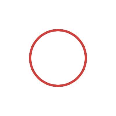
Next, we configure some layer properties to show the circle. Because we're drawing the circle using a path, we can simply set lineWidth to however thick we want the line to be. We also clear out the fillColor and set the strokeColor. Note the two properties take a CGColor not UIColor.
All we need to do now is configure the path object itself. We want to the circle to be as big as the view so it will draw itself at the right size when the view is resized. We do this in layoutSubviews(). We calculate the center position halfway between the width and height of the bounds. Because we want the circle to fit within the view, the radius can't be bigger than the view's width or height. We take the smaller of them and halve it. Finally we need to subtract half of the lineWidth because the stroke draws outward from the center of the path.
To make things simple later on, let's have the path draw from the top-most position and run clockwise. If you remember enough geometry, angles are measured from the positive x-axis and go clockwise. So we start at -M_PI_2 or -90 degrees.
Build and run and you should see a red circle:
Let's take advantage of some of the new features and make debugging our custom view a bit more manageable. Let's have the view display in Interface Builder:
@IBDesignable
class SpinningView: UIView {
    ...

    override func prepareForInterfaceBuilder() {
        super.prepareForInterfaceBuilder()
        setup()
    }
}
By providing the @IBDesignable attribute and the prepareForInterfaceBuilder() method, we tell Xcode to draw our view's custom appearance in Interface Builder. You can test this out by going to the storyboard.
Next we can adopt the tintColor attribute by implementing the following:
func setup() {
    ...
    tintColorDidChange()
}

override func tintColorDidChange() {
    super.tintColorDidChange()
    circleLayer.strokeColor = tintColor.CGColor
}
Go into the storyboard and see the circle change color. Change the Tint in the Attributes Inspector and notice how the color changes.
We'll expose one more property to control the lineWidth:
@IBInspectable var lineWidth: CGFloat = 4 {
    didSet {
        circleLayer.lineWidth = lineWidth
        setNeedsLayout()
    }
}

func setup() {
    circleLayer.lineWidth = lineWidth
    ...
}
Have a go at changing the property in the Attributes Inspector. The @IBDesignable and @IBInspectable attributes make it really easy to debug custom views!
Alright, let's get into the meat of the experiment and have a try at animating the circle. The animation can be broken down into a few parts.
- The stroke is animated from the beginning of the path to the end of the path. This animation can be broken up further.
- The end position of the stroke is animated from the beginning of the path to the end of the path.
- The start position of the stroke is animated from the beginning of the path to the end of the path.
- The circle itself is put into rotation.
Let's start with the strokeEnd animation:
let strokeEndAnimation: CAAnimation = {
    let animation = CABasicAnimation(keyPath: "strokeEnd")
    animation.fromValue = 0
    animation.toValue = 1
    animation.duration = 2
    animation.timingFunction = CAMediaTimingFunction(name: kCAMediaTimingFunctionEaseInEaseOut)
    animation.repeatCount = MAXFLOAT
    return animation
    }()
The strokeEnd and strokeStart properties take a value from 0 (beginning of the path) to 1 (end of the path). We're also using a timing function of ease-in-ease-out to make the animation a bit more natural-looking. Finally, the repeatCount is the number of times the animation will repeat. We'll just set this to a large number.
Next we'll add a property to control this growing animation:
@IBInspectable var animating: Bool = true {
    didSet {
        updateAnimation()
    }
}

func setup() {
    ...

    tintColorDidChange()
    updateAnimation()
}

func updateAnimation() {
    if animating {
        circleLayer.addAnimation(strokeEndAnimation, forKey: "strokeEnd")
    }
    else {
        circleLayer.removeAnimationForKey("strokeEnd")
    }
}
Build and run and you should see the following:

Next, we'll add animation for strokeStart so the stroke shrinks at the other end as it grows clockwise. However, we need to sort of delay the shrinking so it won't shrink at the same rate it grows. We need to create an animation group to add this delay.
let strokeEndAnimation: CAAnimation = {
    let animation = CABasicAnimation(keyPath: "strokeEnd")
    animation.fromValue = 0
    animation.toValue = 1
    animation.duration = 2
    animation.timingFunction = CAMediaTimingFunction(name: kCAMediaTimingFunctionEaseInEaseOut)

    let group = CAAnimationGroup()
    group.duration = 2.5
    group.repeatCount = MAXFLOAT
    group.animations = [animation]

    return group
    }()

let strokeStartAnimation: CAAnimation = {
    let animation = CABasicAnimation(keyPath: "strokeStart")
    animation.beginTime = 0.5
    animation.fromValue = 0
    animation.toValue = 1
    animation.duration = 2
    animation.timingFunction = CAMediaTimingFunction(name: kCAMediaTimingFunctionEaseInEaseOut)

    let group = CAAnimationGroup()
    group.duration = 2.5
    group.repeatCount = MAXFLOAT
    group.animations = [animation]

    return group
    }()

func updateAnimation() {
    if animating {
        circleLayer.addAnimation(strokeEndAnimation, forKey: "strokeEnd")
        circleLayer.addAnimation(strokeStartAnimation, forKey: "strokeStart")
    }
    else {
        circleLayer.removeAnimationForKey("strokeEnd")
        circleLayer.removeAnimationForKey("strokeStart")
    }
}
Build and run and you should see the following:

Finally, we'll add the rotation for a last bit of polish.
let rotationAnimation: CAAnimation = {
      let animation = CABasicAnimation(keyPath: "transform.rotation.z")
      animation.fromValue = 0
      animation.toValue = M_PI * 2
      animation.duration = 4
      animation.repeatCount = MAXFLOAT
      return animation
      }()

func updateAnimation() {
    if animating {
        circleLayer.addAnimation(strokeEndAnimation, forKey: "strokeEnd")
        circleLayer.addAnimation(strokeStartAnimation, forKey: "strokeStart")
        circleLayer.addAnimation(rotationAnimation, forKey: "rotation")
    }
    else {
        circleLayer.removeAnimationForKey("strokeEnd")
        circleLayer.removeAnimationForKey("strokeStart")
        circleLayer.removeAnimationForKey("rotation")
    }
}
And there we have it - a Material Design-styled loading spinner!