My book on iOS interface design, Design Teardowns: Step-by-step iOS interface design walkthroughs is now available!
Design Teardown: Stretchy Headers
The Yahoo News Digest app brings an interesting approach to reading news. It refreshes with a curated selection twice a day, making for a quick read. It also packs a couple of interesting design elements we'll discuss in this post.
The following is a chapter from my upcoming book, Design Teardowns: Step-by-step iOS interface design walkthroughs. If you like this or have a suggestion for another UI teardown, let me know or join my mailing list and get access to the sample code.
Goal
We are going to recreate the stretchy headers effect from the Yahoo News Digest app. The final result looks something like this:

Observations
There is an image at the top.
Yes, there is. In fact it looks like the top of a list (a table view, in iOS terminology). In fact, the image is likely part of a header in the table view.
There is sort of parallax effect when pulling down.
This is a complicated one. As we pull down on the table view, the header actually grows such that the top of it stays at the top of the screen. The image then expands proportionally (maintaining its aspect ratio) so that it fills the newly grown header size.
There is a cut-away at the bottom of the image.
Yes, there is. Looks cool, eh?
There is no status bar.
Removing the status bar makes for a cleaner look.
Prerequisites
This teardown requires Xcode 6 and above and resulting project works on iOS 8 and above. You should also know the following concepts:
Xcode Basics
You should know your way around Xcode including how to access files, navigators and inspectors.
UIKit Basics
You should know how to create views (in code and in Interface Builder) as well as how to manipulate properties on UIView and its subclasses.
Auto Layout
You should know how to create and configure constraints for views using Storyboards. If you need a refresher, check out this excellent tutorial by Yari D'areglia.
Game Plan
We'll adopt a table view controller, and add a header to the table view. Because table view is a scroll view subclass, we can subscribe to delegate callbacks tracking its scroll events. As the table view scrolls we can check the current scroll position or contentOffset, and position the header view accordingly.
Blueprint
Project Setup
In Xcode, open the File menu and select New then Project. Choose Single View Application from the iOS, Application template list on the left.
Name the project StretchyHeaders or whatever else you please. Select Swift from Language. We're building for iPhone from Devices.
Select your destination location and click Create to finish creating your project.
Setting up the table view
The list hierarchy we've observed is best represented in iOS as a instance of UITableView. We're going to remove the UIViewController which comes with the template and use a UITableViewController which manages a table view.
Select ViewController.swift from the Project navigator and change the class from UIViewController to UITableViewController:
class ViewController: UITableViewController ...
Select Main.storyboard from the Project navigator, then the view controller and press delete. Then drag in a table view controller from the Object library. Then click on the Identity inspector and select ViewController under Custom Class. This means that when the storyboard is initialized, the logic will be supplied from ViewController.swift.
Next we will designate the table view controller as the first view controller to appear. Click on the Attributes inspector and select Is Initial View Controller.
Before we can display contents in the table view, we need to setup a prototype for the table view cell that will display the news headlines. The final layout for the cell is shown below:
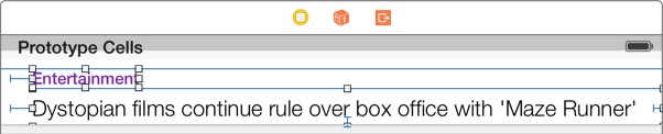
There are 2 labels, one for the category of the news item and another for the summary. Visually, we distinguish the 2 using color and font face.
Add 2 labels from the Object library to the table view cell and add the relevant Auto Layout constraints:
Ctrl+drag (or drag using the right mouse button) to create constraints from one view to another.
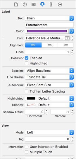
Here's the setup in the Attributes inspector for the category label:
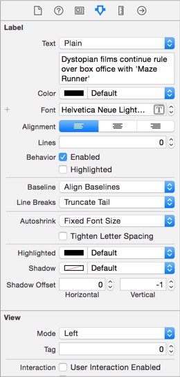
Here's the setup in the Attributes inspector for the summary label, note the Lines property has been set to 0 to allow the label to word wrap and show more than one line of text (0 is used when you don't want a hard maximum on the number of lines to display):
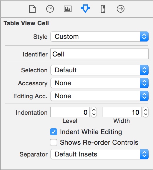
Select the table view cell and set the cell identifier in the Attributes inspector:
Next click on ViewController.swift in the Project navigator.
We return true in prefersStatusBarHidden() to make the status bar hidden when the view controller appears on the screen:
override func prefersStatusBarHidden() -> Bool {
    return true
}
Then we set the table view's row height to UITableViewAutomaticDimension. This allows iOS to resize the cells automatically according to our Auto Layout constraints. Ensure you have vertical constraints running through the top of the cell to the bottom for this to work.
override func viewDidLoad() {
    ...

    tableView.rowHeight = UITableViewAutomaticDimension
}
Issue on iOS 8.3: It seems the table view does not respond to the above. Instead implement the delegate methods as follows:
// MARK: - UITableViewDelegate

override func tableView(tableView: UITableView, heightForRowAtIndexPath indexPath: NSIndexPath) -> CGFloat {
    return UITableViewAutomaticDimension
}

override func tableView(tableView: UITableView, estimatedHeightForRowAtIndexPath indexPath: NSIndexPath) -> CGFloat {
    return UITableViewAutomaticDimension
}
Next we will configure the table view's data source to tell the table view how to display its contents.
Firstly, we tell our table view to display 5 rows (for now):
override func tableView(tableView: UITableView, numberOfRowsInSection section: Int) -> Int {
    return 5
}
Then we have the table view use the prototype table view cell with the identifier Cell from the storyboard we configured earlier:
override func tableView(tableView: UITableView, cellForRowAtIndexPath indexPath: NSIndexPath) -> UITableViewCell {
    let cell = tableView.dequeueReusableCellWithIdentifier("Cell", forIndexPath: indexPath) as UITableViewCell
    return cell
}
We need the
as UITableViewCelldowncast to convertAnyObject!toUITableViewCellbecausefunc dequeueReusableCellWithIdentifier(_ identifier: String!) -> AnyObject!originates from Objective-C API
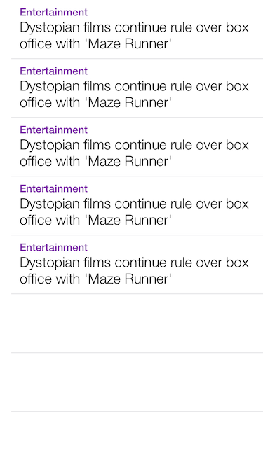
Build and run and you should see the following:
Populating the Table View
Next we'll adopt a simple data model structure that's easy to work with in Swift to provide sample data to the table view.
Let's add a new file to the project, open the File menu, then select New and then File or just hit ⌘+N. Choose Swift File from the list of available templates.
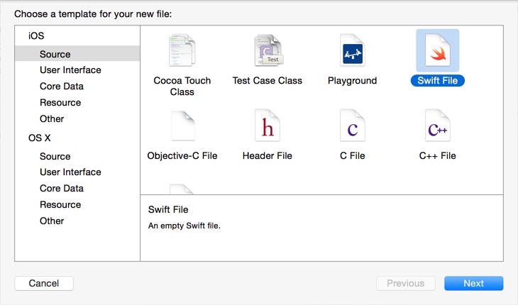
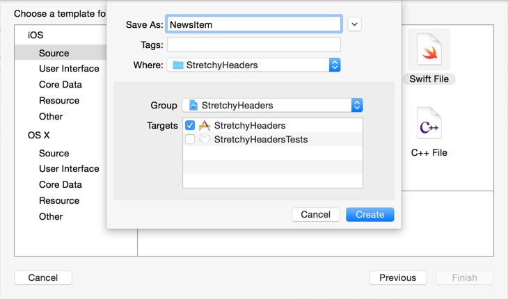
Name it NewsItem. This will contain the data model that fully describes how to display the table view cell.
Our data model needs to contain the category and summary to display. Add the following code to NewsItem.swift:
import Foundation
import UIKit

struct NewsItem {
    enum NewsCategory {
        case World
        case Americas
        case Europe
        case MiddleEast
        case Africa
        case AsiaPacific

        func toString() -> String {
            switch self {
            case .World:
                return "World"
            case .Americas:
                return "Americas"
            case .Europe:
                return "Europe"
            case .MiddleEast:
                return "Middle East"
            case .Africa:
                return "Africa"
            case .AsiaPacific:
                return "Asia-Pacific"
            }
        }

        func toColor() -> UIColor {
            switch self {
            case .World:
                return UIColor(red: 0.106, green: 0.686, blue: 0.125, alpha: 1)
            case .Americas:
                return UIColor(red: 0.114, green: 0.639, blue: 0.984, alpha: 1)
            case .Europe:
                return UIColor(red: 0.322, green: 0.459, blue: 0.984, alpha: 1)
            case .MiddleEast:
                return UIColor(red: 0.502, green: 0.290, blue: 0.984, alpha: 1)
            case .Africa:
                return UIColor(red: 0.988, green: 0.271, blue: 0.282, alpha: 1)
            case .AsiaPacific:
                return UIColor(red: 0.620, green: 0.776, blue: 0.153, alpha: 1)
            }
        }
    }

    let category: NewsCategory
    let summary: String
}
The code exposes a new composite data type in the form of a struct called NewsItem. The bulk of the file defines the nested type NewsCategory. It is an enumeration because the news categories take a finite number of distinct values. The enumeration also exposes convenience methods func toString() -> String and func toColor() -> UIColor that return the right display attributes for a particular news category.
Finally we have 2 properties, category and summary that describe the news item to be displayed.
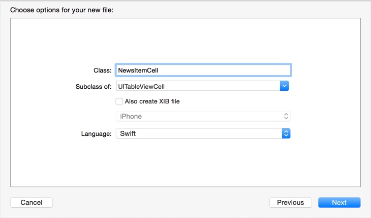
Next we'll create a custom subclass of UITableViewCell to handle the interface logic for the table view cell. Open the File menu, then select New and then File or just hit ⌘+N. Choose Swift File from the list of available templates.
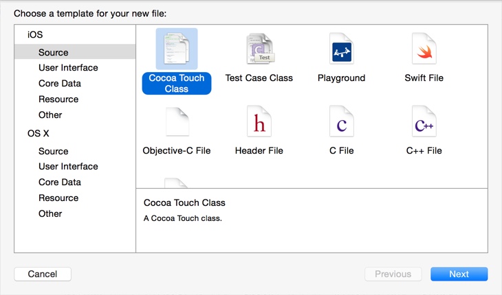
Name it NewsItemCell then click Next and then Create.
We need to set the custom class of the table view cell to be NewsItemCell to have logic supplied from NewsItemCell.swift. Select Main.storyboard in the Project navigator.
Again we will change the custom class of the table view cell:
Next create outlet connections for the 2 labels to the NewsItemCell.swift file:
Ctrl+drag (or drag using the right mouse button) to create outlets from the storyboard in your view controllers.
We need to handle interface logic in the table view cell. Add the following to NewsItemCell.swift after the outlet declarations:
var newsItem: NewsItem? {
    didSet {
        if let item = newsItem {
            categoryLabel.text = item.category.toString()
            categoryLabel.textColor = item.category.toColor()
            summaryLabel.text = item.summary
        }
        else {
            categoryLabel.text = nil
            summaryLabel.text = nil
        }
    }
}
We've added a property called
newsItemwhich is of optional type,NewsItem?. It's optional because when the cell is created, we don't yet know whichNewsItemwill be assigned to the cell for display. Making it optional will allow a value ofnilwhen the cell is first created.
Swift allows us to include logic under didSet (known as a Property Observer) which will get triggered when the property is set. In this case, we are using this hook to update the labels in the cell.
Next we use the if let control structure (also known as Optional Binding) to test if the property contains a nil value and update the cell accordingly.
We're almost there. Let's create some sample data in ViewController.swift so we can test our table view. Add the following to top of the class:
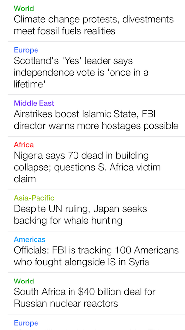
let items = [
    NewsItem(category: .World, summary: "Climate change protests, divestments meet fossil fuels realities"),
    NewsItem(category: .Europe, summary: "Scotland's 'Yes' leader says independence vote is 'once in a lifetime'"),
    NewsItem(category: .MiddleEast, summary: "Airstrikes boost Islamic State, FBI director warns more hostages possible"),
    NewsItem(category: .Africa, summary: "Nigeria says 70 dead in building collapse; questions S. Africa victim claim"),
    NewsItem(category: .AsiaPacific, summary: "Despite UN ruling, Japan seeks backing for whale hunting"),
    NewsItem(category: .Americas, summary: "Officials: FBI is tracking 100 Americans who fought alongside IS in Syria"),
    NewsItem(category: .World, summary: "South Africa in $40 billion deal for Russian nuclear reactors"),
    NewsItem(category: .Europe, summary: "'One million babies' created by EU student exchanges"),
]
This creates an array called items that houses NewsItem values that make up the sample data we wish to display. Notice the convenience initializers we use for the NewsItem struct - Swift generates them automatically.
We will need to change the table view data source methods. We now return the count of elements in the items array as the number of rows we want in the table which makes the table view display as many rows as the sample items we have created:
override func tableView(tableView: UITableView, numberOfRowsInSection section: Int) -> Int {
    return items.count
}
Next when we setup the table view cell in func tableView(tableView: UITableView, cellForRowAtIndexPath indexPath: NSIndexPath, we have to retrieve the NewsItem value from items corresponding to the row number of the table view cell to display. Then we set the newsItem property with this item. At this point our didSet property observer will update the cell's labels.
override func tableView(tableView: UITableView, cellForRowAtIndexPath indexPath: NSIndexPath) -> UITableViewCell {

    let item = items[indexPath.row]
    let cell = tableView.dequeueReusableCellWithIdentifier("Cell", forIndexPath: indexPath) as NewsItemCell
    cell.newsItem = item

    return cell
}
Build and run and you should see the following:
Building the table header
Now we will create the header for our table view. We will add a background image to the Asset Catalog for use later.
Add the following image to Images.xcassets:

Select Main.storyboard and add a view to the top of the table. Next add an image view and a label and arrange them accordingly:
Note we've set the Content Mode of the image view to Aspect Fill to make sure that the image is scaled proportionally to fill the dimensions of the image view and not squashed.
Build and run and you should see the following:

We're pretty close but the header is like a regular header view, scrolling with the table view.
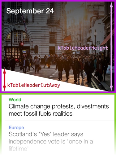
Because we are going to use the header height value in our calculations in several places, we'll add a constant the top of the file. This makes it easier to adjust should we decide to have a different value for the table header height later on. Add the following to the top of ViewController.swift above the class definition:
private let kTableHeaderHeight: CGFloat = 300.0
To allow us to manage the table header we can't use the tableHeaderView property of UITableView because the table view manages the frame of its table header. We need to create and manage our own view. Add the following property right before items:
var headerView: UIView!
We're using an Implicitly Unwrapped Optional,
UIView!. It behaves essentially like the Optional type,UIView?but we don't have to consider unwrapping it when using it. This is useful because we don't want to override the view controller's initializers to supply a default value (we will retrieve the view from the storyboard.)
Next when the view controller loads, we will take ownership of the header view we've so nicely setup in the storyboard and then remove it from the table view. This means that the table view will effectively have no table header view to manage. We will manage the headerView directly in a bit. Update func viewDidLoad() to look like this:
override func viewDidLoad() {
    ...

    headerView = tableView.tableHeaderView
    tableView.tableHeaderView = nil
}
Now we have a reference to the header view via headerView. We need to add it to tableView to ensure it is still in the view hierarchy.
override func viewDidLoad() {
    ...

    tableView.addSubview(headerView)
}
We'll push the contents of the table view down by the height of the header or kTableHeaderHeight, then set the contentOffset downward by the same amount so we start off with the header view completely visible (-kTableHeaderHeight is the top of the table view now that we've inset its contents by exactly kTableHeaderHeight.)
override func viewDidLoad() {
    ...

    tableView.contentInset = UIEdgeInsets(top: kTableHeaderHeight, left: 0, bottom: 0, right: 0)
    tableView.contentOffset = CGPoint(x: 0, y: -kTableHeaderHeight)
    updateHeaderView()
}
UIScrollViewscrolls by changing thecontentOffsetproperty. This tells the scroll view how far into its bounds the top-left visible region is. SimilarlycontentInsettells the scroll view how far into itsframeit should position its content.
This next part requires a little bit of math, we'll add a method to handle updates to the headerView as the table view scrolls. Essentially most of the time when the scroll view is scrolling normally we update the frame of the header view such that its at the top of the table view (-kTableHeaderHeight) but when we happened to be pulled down beyond the top of the table view (i.e. the contentOffset is a smaller value than -kTableHeaderHeight) we position the header view right at that offset and extend the height of the header view. Because we've set the image view to resize with the aspect fill content mode, the header will look right at any size.
Add the update method to the view controller:
func updateHeaderView() {
    var headerRect = CGRect(x: 0, y: -kTableHeaderHeight, width: tableView.bounds.width, height: kTableHeaderHeight)
    if tableView.contentOffset.y < -kTableHeaderHeight {
        headerRect.origin.y = tableView.contentOffset.y
        headerRect.size.height = -tableView.contentOffset.y
    }

    headerView.frame = headerRect
}
Note when we use
frameandbounds. On the simplest level, theboundsis the view's dimensions in its own coordinate system and theframeis the view's dimensions in its parent's (or superview's) coordinate system.
We're now just missing the call to the update method, add UIScrollViewDelegate to the class definition:
class ViewController: UITableViewController, UIScrollViewDelegate ...
And add this delegate callback so we can get notified as the scroll view scrolls:
override func scrollViewDidScroll(scrollView: UIScrollView) {
    updateHeaderView()
}
Build and run and you should see the following:

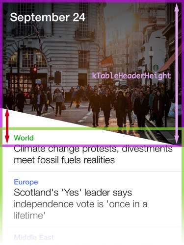
Cutting the cut-away
To accomplish the last bit of removing a triangular region of the header view, we could either overlay an image or use a layer mask. We will be experimenting with the latter because its simply a more versatile technique that has minimum reliance on design assets.
Again it's useful to have another constant for the cut-away height. We add the following to the top of ViewController.swift above the class definition:
private let kTableHeaderCutAway: CGFloat = 80.0
Next we will add a CAShapeLayer property for our masking layer. This layer determines which portion of the header view will be visible.
var headerMaskLayer: CAShapeLayer!
Next setup the property in viewDidLoad() like this:
override func viewDidLoad() {
    ...

    headerMaskLayer = CAShapeLayer()
    headerMaskLayer.fillColor = UIColor.blackColor().CGColor

    headerView.layer.mask = headerMaskLayer
    updateHeaderView()
}
Note we moved the call to
updateHeaderView()to the bottom offunc viewDidLoad()so we can setup the masking layer before we update.
Next we need to create a UIBezierPath that describes the region of the header view we want to make visible and set that path on the masking layer. We need specify the 4 corner points of the trapezium. The following diagram explains the effect of applying the layer mask using the specified path:
Add this the bottom of updateHeaderView():
func updateHeaderView() {
    ...

    let path = UIBezierPath()
    path.moveToPoint(CGPoint(x: 0, y: 0))
    path.addLineToPoint(CGPoint(x: headerRect.width, y: 0))
    path.addLineToPoint(CGPoint(x: headerRect.width, y: headerRect.height))
    path.addLineToPoint(CGPoint(x: 0, y: headerRect.height-kTableHeaderCutAway))
    headerMaskLayer?.path = path.CGPath
}
The Optional Chaining operator
?inheaderMaskLayer?.pathwill update thepathproperty if and only ifheaderMaskLayeris notnil
Build and run and you should see the following:

The last thing we need to do it have the header view overlap the table view contents slightly.
We need to inset the table view a little less like this:
To do this, we need to adjust the content inset in viewDidLoad() to be somewhat less (about half the height of the cut-away seems to be a good idea):
override func viewDidLoad() {
    ...

    let effectiveHeight = kTableHeaderHeight-kTableHeaderCutAway/2
    tableView.contentInset = UIEdgeInsets(top: effectiveHeight, left: 0, bottom: 0, right: 0)
    tableView.contentOffset = CGPoint(x: 0, y: -effectiveHeight)

    ...
}
We also have to update corresponding bit in updateHeaderView():
func updateHeaderView() {
    ...

    let effectiveHeight = kTableHeaderHeight-kTableHeaderCutAway/2
    var headerRect = CGRect(x: 0, y: -effectiveHeight, width: tableView.bounds.width, height: kTableHeaderHeight)
    if tableView.contentOffset.y < -effectiveHeight {
        headerRect.origin.y = tableView.contentOffset.y
        headerRect.size.height = -tableView.contentOffset.y + kTableHeaderCutAway/2
    }

    ...
}
After tweaking the table header height and other UI parameters we get the final result:
Afterthoughts
That's it, we've created the Stretchy Headers effect. You've learnt how to:
- Setup and configure a table view
- Add a prototype cell in the storyboard and refer to it later
- Use a simple data model to manage complexity
- Track the scroll events from a scroll view
- Mask views using Core Animation
Next Steps
To add more polish you can try the following:
- Update the text in the header with current date and time
If you liked this teardown, want to receive updates on the book, or want to play with the sample code subscribe to my mailing list (your email will not be shared):