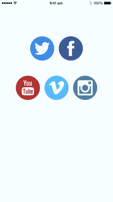
Duolingo is an awesome app for learning new languages. Not only does it present an effective systematic approach to learning but it also has incredibly fluid interfaces making the learning process that much engaging.
The following is a chapter from my upcoming book, Design Teardowns: Practical Interface Design for iOS. If you like this or have a suggestion for another UI teardown, let me know or join my mailing list.
Goal
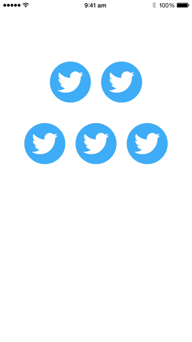
We are going to recreate the zooming icons effect from the menu of Duolingo. The final result looks something like this:
Observations
The menu is made of rows of icons.
While not exactly a grid, the icons are centered in a scroll view. This regular collection of items hints that maybe we could use a collection view to present them.
Selecting the item expands it to fill the screen.
When an item is tapped, both the circular background and the icon zooms into the center of the screen and scales up. This happens fluidly as part of the view controller transition.
The other interface elements slide in the from the edges.
The labels slide in from the bottom and the back button slides in from the top.
Prerequisites
This teardown requires Xcode 6 and above and resulting project works on iOS 8 and above. You should also know the following concepts:
Xcode Basics
You should know your way around Xcode including how to create projects and classes, and access files, navigators and inspectors. You should also know how to create outlets and actions in interface builder (check out the previous teardown if you don't already know this.)
UIKit Basics
You should know how to create views (in code and in Interface Builder) as well as how to manipulate properties on UIView and its subclasses. You should also know how to use Auto Layout.
Game Plan
We'll adopt and customize a UICollectionView to display the rows of icons and implement a general way to perform the rather complex transition by providing a customizing the UINavigationController's transition.
Blueprint
Setting up the Collection View
Start a new Xcode project with the Single View Application template. Go into Main.storyboard and remove the default view controller (click on it and press delete.)
Drag the Collection View Controller from the Object Library onto the storyboard. We're using a collection view because we can represent each individual button as a collection view cell.
You may also decide to use a table view. Because there seems to be an arbitrary number of items per row and that would make laying out items rather complex in a table view (table views only allow one cell, and hence item, per row).
Change the collection view's background color to white in the Attributes Inspector. Next adjust the cell size such that it's a square and add a view for the background (we'll call this the colored view) and an image view for the icon. Set the identifier of the cell in the Attributes Inspector to Cell.
We'll add a subclass of UICollectionViewController called MenuViewController. This file will house the logic for dealing with the collection view controller we setup in the storyboard.
In the storyboard, set the custom class of the view controller to MenuViewController in the Identity Inspector. Also ensure Is Initial View Controller is checked in the Attributes Inspector.
In order to have a customizable number of items per row, what we'll do is have each row correspond to a section in the collection view's layout. Add the following data source methods to MenuViewController:
override func numberOfSectionsInCollectionView(collectionView: UICollectionView) -> Int {
    return 2
}

override func collectionView(collectionView: UICollectionView, numberOfItemsInSection section: Int) -> Int {
    switch section {
    case 0:
        return 2
    case 1:
        return 3
    default:
        return 0
    }
}
Because we're registering the collection view cell implicitly through the storyboard, go ahead and remove the cell registration from viewDidLoad():
self.collectionView.registerClass(UICollectionViewCell.self, forCellWithReuseIdentifier: reuseIdentifier)
Build and run and you should see the following:
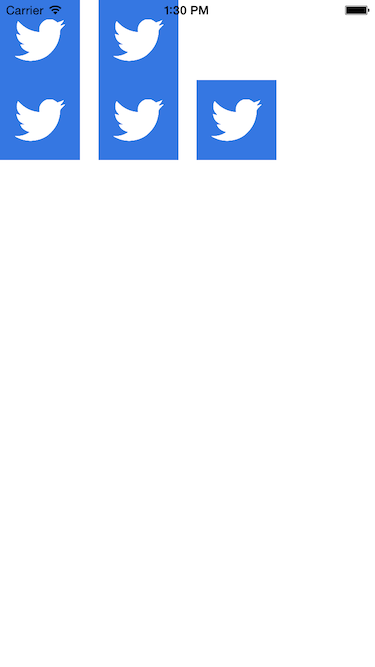
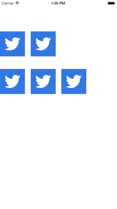
Next we'll push the items downward some amount to they stay clear of the status bar. We can do this by setting the contentInset property of the collectionView:
override func viewDidLoad() {
    super.viewDidLoad()

    collectionView.contentInset = UIEdgeInsets(top: 100, left: 0, bottom: 0, right: 0)
}
We'll also go into the storyboard and set up the section inset of the collection view in the Attributes Inspector. I've chosen a bottom inset of 40 to introduce some spacing between sections (rows in our case.)
Build and run and you should see the following:
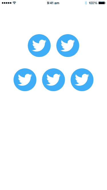
Now we'll want to center the items. To do this, we'll override the section inset on a per section basis and compute the left and right inset necessary to introduce horizontal spacing. Add the following delegate method to MenuViewController:
func collectionView(collectionView: UICollectionView, layout collectionViewLayout: UICollectionViewLayout, insetForSectionAtIndex section: Int) -> UIEdgeInsets {
    let layout = collectionViewLayout as UICollectionViewFlowLayout
    let cellWidth = layout.itemSize.width

    let numberOfCells = self.collectionView(collectionView, numberOfItemsInSection: section)
    let widthOfCells = CGFloat(numberOfCells) * layout.itemSize.width + CGFloat(numberOfCells-1) * layout.minimumInteritemSpacing

    let inset = (collectionView.bounds.width - widthOfCells) / 2.0

    return UIEdgeInsets(top: 0, left: inset, bottom: 40, right: inset)
}
We first retrieve some basic information like the cell width and number of cells in the section (row) from the layout object. We calculate the width required by the cells and the spacing between them. (Note that X units of cells have X-1 units of padding between the cells.) The difference between this width and the width of the collection view is the inset we need on the left and right.
Build and run and you should see the following:
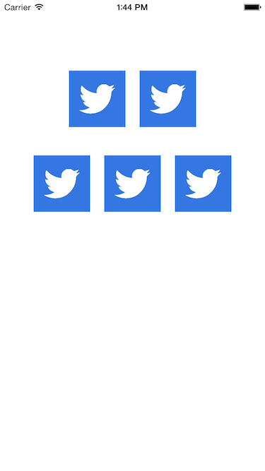
Setting up the Collection View Cell
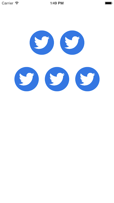
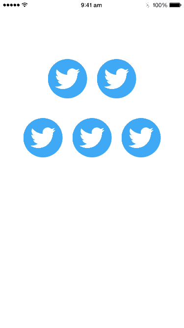
Next we'll add rounded corners to each collection view cell item. To do any sort of further customization outside of Interface Builder we need to create a custom subclass. Add a new subclass of UICollectionViewCell called SocialItemCell.
Add the following properties to SocialItemCell and make the connections to the outlets in the storyboard:
@IBOutlet weak var imageView: UIImageView!
@IBOutlet weak var coloredView: UIView!
We're calling the view providing the background color coloredView because we want to avoid conflicting with the backgroundView property on UICollectionViewCell.
Next we will override layoutSubviews to add rounded corners to coloredView:
override func layoutSubviews() {
    super.layoutSubviews()
    coloredView.layer.cornerRadius = bounds.width/2.0
    coloredView.layer.masksToBounds = true
}
Setting the corner radius of a layer to half of the width creates the effect of a circular mask when the height and width are equal.
Set the custom class of the collection view cell in the storyboard to the newly created subclass in the Identity Inspector.
Build and run and you should see the following:
Creating the Detail View Controller
Add a new View Controller for our detail view to the storyboard and setup the view hierarchy as shown below:
There is the background view and image view similar to what we had in the collection view cell. In addition we also have a couple more labels and a back button.
Create a backing view controller called DetailViewController, a UIViewController subclass. Go back to the storyboard and set up the custom class in the Identity Inspector. At the same time, we'll set the Storyboard ID to the same value DetailViewController. This will allows us to retrieve the view controller programmatically later.
Finally with the MenuViewController selected in the storyboard, choose Embed In, Navigation Controller from the Editor menu. Uncheck Shows Navigation Bar in the Attributes Inspector with the Navigation Controller selected. This will allow us to use UINavigationController and its corresponding push and pop transitions but with the navigation bar hidden.
Now when the icons get tapped, we want to transition into the detail view controller. Add the following delegate method to MenuViewController:
// MARK: UICollectionViewDelegate

override func collectionView(collectionView: UICollectionView, didSelectItemAtIndexPath indexPath: NSIndexPath) {
    let controller = UIStoryboard(name: "Main", bundle: nil).instantiateViewControllerWithIdentifier("DetailViewController") as DetailViewController
    navigationController?.pushViewController(controller, animated: true)
}
We use the
UIStoryboardclass to get programmatic access to the storyboard and then use the methodinstantiateViewControllerWithIdentifier()with the matching Storyboard ID from earlier to get a instance of the view controller.
We're almost ready to test the transition. Because we have decided to hide the navigation bar, we're now responsible for allowing the user to return to the previous view controller.
Add the following action to the DetailViewController and wire up the connection in the storyboard:
@IBAction func handleBackButton(sender: AnyObject) {
    navigationController?.popViewControllerAnimated(true)
}
Build and run and you should see the following:
Creating the Custom Transition
Now we're ready to create the custom transition we need. We want the transition to have the following qualities:
It has to be general and easy to use. This is made possible via new APIs from iOS 7 which allow us to hook into the system transitions for modal view controllers as well as navigation controllers.
It should degrade gracefully when the view controllers in use do not conform to the right layout (in their view hierarchy) for the zooming effect. We can achieve this using protocols.
Firstly, we'll create an object to handle this transition. Create an NSObject subclass called ZoomingIconTransition. Next, let's do some basic setup so we can see how the transition is customized.
Our transition object needs to conform to the UIViewControllerAnimatedTransitioning protocol so we can provide custom animations for the transition. After which, we need to implement transitionDuration() to provide the duration of the transition and also animateTransition() to perform any animations we require.
We will add a constant kZoomingIconTransitionDuration so we can abstract away the actual length of the transition and then return this value in transitionDuration():
import UIKit

private let kZoomingIconTransitionDuration: NSTimeInterval = 0.6

class ZoomingIconTransition: NSObject, UIViewControllerAnimatedTransitioning {
    func transitionDuration(transitionContext: UIViewControllerContextTransitioning) -> NSTimeInterval {
        return kZoomingIconTransitionDuration
    }
}
Next, we will implement animateTransition() by first extracting some transition parameters from the transitionContext. This object is supplied to us in Apple's APIs and gives us information about the view controllers and the container view for the transition.
class ZoomingIconTransition: NSObject, UIViewControllerAnimatedTransitioning {
    ...

    func animateTransition(transitionContext: UIViewControllerContextTransitioning) {
        let duration = transitionDuration(transitionContext)
        let fromViewController = transitionContext.viewControllerForKey(UITransitionContextFromViewControllerKey)!
        let toViewController = transitionContext.viewControllerForKey(UITransitionContextToViewControllerKey)!
        let containerView = transitionContext.containerView()
    }
}
The transition happens inside a sandbox called the
containerView. When we perform the animations, we need to make sure we add the views of the view controllers into the container view so they can be on-screen during the transition.
Now we have to do some initial setup for the animation. Usually we'd want to hide the view of the destination view controller, toViewController and gradually have it animate into place. This is also the right place to add views to the container view.
func animateTransition(transitionContext: UIViewControllerContextTransitioning) {
    ...

    // setup animation
    containerView.addSubview(fromViewController.view)
    containerView.addSubview(toViewController.view)
    toViewController.view.alpha = 0
}
Finally, we handle the animation using UIKit provided animation APIs and then call the completeTransition() method on transitionContext when we are done to tell the system the transition has ended:
func animateTransition(transitionContext: UIViewControllerContextTransitioning) {
    ...

    // perform animation
    UIView.animateWithDuration(duration, delay: 0, usingSpringWithDamping: 1, initialSpringVelocity: 0, options: .allZeros, animations: { () -> Void in
        [self]
        toViewController.view.alpha = 1
    }, completion: {
        (finished) in
        transitionContext.completeTransition(!transitionContext.transitionWasCancelled())
    })
}
For now we've simply made the destination view controller's view invisible (by setting its alpha to 0) and then animate it to visible (by setting its alpha to 1).
We need one more piece before we can test out the transition. We have to tell iOS that we are intercepting the push (and pop) transitions of the navigation controller. This can be done by providing a delegate method on the UINavigationController's delegate.
Go into the storyboard and drag Object from the Object Library onto the Navigation Controller. In the Identity Inspector set the custom class to ZoomingIconTransition and in the navigation controller's Connections Inspector, drag the delegate outlet to this object.
Now make ZoomingIconTransition conform to UINavigationControllerDelegate and add the following method:
class ZoomingIconTransition: NSObject, UINavigationControllerDelegate, UIViewControllerAnimatedTransitioning {
    ...

    func navigationController(navigationController: UINavigationController, animationControllerForOperation operation: UINavigationControllerOperation, fromViewController fromVC: UIViewController, toViewController toVC: UIViewController) -> UIViewControllerAnimatedTransitioning? {
        return self
    }
}
This returns the same ZoomingIconTransition object to handle the transition when requested by UINavigationController.
Build and run and you should see the following:
Adding the Zoom Effect
Next, we'll define a protocol in ZoomingIconTransition. View controllers can conform to this protocol in order to provide our transition object with the image view and colored background view. If the view controllers on both ends of the transition conform to this protocol, we know that the view controllers have the right view hierarchy and we can animate the transition using the zooming effect.
Let's add methods to the protocol to return the image view and background view:
@objc
protocol ZoomingIconViewController {
    func zoomingIconColoredViewForTransition(transition: ZoomingIconTransition) -> UIView?
    func zoomingIconImageViewForTransition(transition: ZoomingIconTransition) -> UIImageView?
}
Protocols are an informal contract (think of a promise in real-life) between objects. If an object conforms to a protocol, it is promising to implement certain methods. With this expectation, we know how to interact with this object.
We're including the @objc attribute here (which tells Xcode that this is an Objective-C protocol) because we can't yet test for conformance using Swift protocols.
We'll update the navigation controller delegate method to test for protocol conformance:
func navigationController(navigationController: UINavigationController, animationControllerForOperation operation: UINavigationControllerOperation, fromViewController fromVC: UIViewController, toViewController toVC: UIViewController) -> UIViewControllerAnimatedTransitioning? {

    // protocol needs to be @objc for conformance testing
    if fromVC is ZoomingIconViewController &&
        toVC is ZoomingIconViewController {
            return self
    }
    else {
        return nil
    }
}
We can return
nilin the above delegate method to fall back on the system transition. This makes it convenient to do so when we realize we cannot proceed with our custom transition.
If you build and run right now, you'll see the transition has reverted back to the regular navigation controller transitions. This is because we haven't implemented the ZoomingIconViewController protocol in MenuViewController and DetailViewController.
We'll go ahead and implement the protocol in the view controllers. In MenuViewController, we will add a property to keep track of the indexPath of the selected cell. This is so we know which cell to animate from/towards during our transition (we'll keep track of it separately from the collection view):
var selectedIndexPath: NSIndexPath?
When a collection view cell gets selected, we'll update this property accordingly:
override func collectionView(collectionView: UICollectionView, didSelectItemAtIndexPath indexPath: NSIndexPath) {
    selectedIndexPath = indexPath
}
Now we'll have MenuViewController conform to the protocol:
class MenuViewController: UICollectionViewController, ZoomingIconViewController {
    ...
}
Next we'll provide the necessary protocol methods zoomingIconColoredViewForTransition() and zoomingIconImageViewForTransition():
func zoomingIconColoredViewForTransition(transition: ZoomingIconTransition) -> UIView? {
    if let indexPath = selectedIndexPath {
        let cell = collectionView.cellForItemAtIndexPath(indexPath) as SocialItemCell
        return cell.coloredView
    }
    else {
        return nil
    }
}

func zoomingIconImageViewForTransition(transition: ZoomingIconTransition) -> UIImageView? {
    if let indexPath = selectedIndexPath {
        let cell = collectionView.cellForItemAtIndexPath(indexPath) as SocialItemCell
        return cell.imageView
    }
    else {
        return nil
    }
}
All we are doing here is checking to see if we have a selection and passing the relevant views back to the transition object.
We will also add the outlets in the storyboard to DetailViewController:
@IBOutlet weak var coloredView: UIView!
@IBOutlet weak var imageView: UIImageView!

@IBOutlet weak var titleLabel: UILabel!
@IBOutlet weak var summaryLabel: UILabel!
Similarly we can implement the protocol on DetailViewController:
class DetailViewController: UIViewController, ZoomingIconViewController {
    ...
}
And also provide implementations for the protocol methods:
func zoomingIconColoredViewForTransition(transition: ZoomingIconTransition) -> UIView? {
    return coloredView
}

func zoomingIconImageViewForTransition(transition: ZoomingIconTransition) -> UIImageView? {
    return imageView
}
Build and run and see that the transition is now back to our custom fading effect.
Now we are ready to finish up our custom transition. One more piece of information we need to is know if it's a push or pop transition.
Let's add a property to the ZoomingIconTransition class:
var operation: UINavigationControllerOperation = .None
We'll update this property in the delegate method:
func navigationController(navigationController: UINavigationController, animationControllerForOperation operation: UINavigationControllerOperation, fromViewController fromVC: UIViewController, toViewController toVC: UIViewController) -> UIViewControllerAnimatedTransitioning? {

    // protocol needs to be @objc for conformance testing
    if fromVC is ZoomingIconViewController &&
        toVC is ZoomingIconViewController {
        self.operation = operation
        return self
    }
    ...
}
This bit of information will let us work out which of the view controllers should be in front of the other:
func animateTransition(transitionContext: UIViewControllerContextTransitioning) {
    ...

    var backgroundViewController = fromViewController
    var foregroundViewController = toViewController

    if operation == .Pop {
        backgroundViewController = toViewController
        foregroundViewController = fromViewController
    }

    // setup animation
    ...
}
We can retrieve the image view for the background and foreground view controllers:
func animateTransition(transitionContext: UIViewControllerContextTransitioning) {
    ...

    // get the image view in the background and foreground view controllers

    let backgroundImageViewMaybe = (backgroundViewController as? ZoomingIconViewController)?.zoomingIconImageViewForTransition(self)
    let foregroundImageViewMaybe = (foregroundViewController as? ZoomingIconViewController)?.zoomingIconImageViewForTransition(self)

    assert(backgroundImageViewMaybe != nil, "Cannot find image view in background view controller")
    assert(foregroundImageViewMaybe != nil, "Cannot find image view in foreground view controller")

    let backgroundImageView = backgroundImageViewMaybe!
    let foregroundImageView = foregroundImageViewMaybe!

    // setup animation
    ...
}
We've simply casted the view controllers to the protocol type ZoomingIconViewController then called the method to obtain the image view. Because the methods return an optional, we use the Forced Unwrapping operator (!) to obtain the views.
Using
asset()gives us a crash if the specified condition is not true, making debugging easier.
Similarly, we can obtain access to the colored background views on each of the view controllers:
func animateTransition(transitionContext: UIViewControllerContextTransitioning) {
    ...

    // get the colored view in the background and foreground view controllers

    let backgroundColoredViewMaybe = (backgroundViewController as? ZoomingIconViewController)?.zoomingIconColoredViewForTransition(self)
    let foregroundColoredViewMaybe = (foregroundViewController as? ZoomingIconViewController)?.zoomingIconColoredViewForTransition(self)

    assert(backgroundColoredViewMaybe != nil, "Cannot find colored view in background view controller")
    assert(foregroundColoredViewMaybe != nil, "Cannot find colored view in foreground view controller")

    let backgroundColoredView = backgroundColoredViewMaybe!
    let foregroundColoredView = foregroundColoredViewMaybe!

    // setup animation
    ...
}
Now we'll create copies of the background view and the image view in the background view controller for animation purposes:
func animateTransition(transitionContext: UIViewControllerContextTransitioning) {
    ...
    // create view snapshots
    // view controller need to be in view hierarchy for snapshotting
    containerView.addSubview(backgroundViewController.view)
    let snapshotOfColoredView = backgroundColoredView.snapshotViewAfterScreenUpdates(false)

    let snapshotOfImageView = UIImageView(image: backgroundImageView.image)
    snapshotOfImageView.contentMode = .ScaleAspectFit

    // setup animation
    ...
}
We can use the
snapshotViewAfterScreenUpdates()method onUIViewfor cloning a view for animations. The view has to be in the view hierarchy for this work so that's why we added the background view controller's view to the container view first.
Add 2 constants to the top of the file, the zoomed scale, which represents how many times we will scale up the circular background view during the transition, and the background scale, which is a slight shrink to the background view controller as we animate the transition.
private let kZoomingIconTransitionZoomedScale: CGFloat = 15
private let kZoomingIconTransitionBackgroundScale: CGFloat = 0.80
Next we'll add a helper method to ZoomingIconTransition to help setup the snapshot views. We'll introduce an enumeration to keep track of the current state:
enum TransitionState {
    case Initial
    case Final
}
We'll also define a new type which is essentially a tuple of views, ZoomingViews:
typealias ZoomingViews = (coloredView: UIView, imageView: UIView)
Tuples are a new data structure in Swift. They are basically an ad-hoc grouping of values and we can decide if we want to provide names to each value.
This gives us the ability to pair views when using the helper method we will introduce very shortly:
func configureViewsForState(state: TransitionState, containerView: UIView, backgroundViewController: UIViewController, viewsInBackground: ZoomingViews, viewsInForeground: ZoomingViews, snapshotViews: ZoomingViews) {
    switch state {
    case .Initial:
        backgroundViewController.view.transform = CGAffineTransformIdentity
        backgroundViewController.view.alpha = 1

        snapshotViews.coloredView.transform = CGAffineTransformIdentity
        snapshotViews.coloredView.frame = containerView.convertRect(viewsInBackground.coloredView.frame, fromView: viewsInBackground.coloredView.superview)
        snapshotViews.imageView.frame = containerView.convertRect(viewsInBackground.imageView.frame, fromView: viewsInBackground.imageView.superview)

    case .Final:
        backgroundViewController.view.transform = CGAffineTransformMakeScale(kZoomingIconTransitionBackgroundScale, kZoomingIconTransitionBackgroundScale)
        backgroundViewController.view.alpha = 0

        snapshotViews.coloredView.transform = CGAffineTransformMakeScale(kZoomingIconTransitionZoomedScale, kZoomingIconTransitionZoomedScale)
        snapshotViews.coloredView.center = containerView.convertPoint(viewsInForeground.imageView.center, fromView: viewsInForeground.imageView.superview)
        snapshotViews.imageView.frame = containerView.convertRect(viewsInForeground.imageView.frame, fromView: viewsInForeground.imageView.superview)

    default:
        ()
    }
}
Our method here helps us to setup the views between 2 states, initial (which is before the zooming takes place) and final (which is after the zooming animation).
For the initial state, we reset the transform of the background view controller and make it visible. We set the frame of the snapshot colored view to be the same as the colored view in the background view controller (i.e. the small circle) and we do similarly for the image view snapshot.
In the final state, we shrink the background view controller slightly and fade it out. We also scale the colored background view such that it covers the screen and move its center such that it grows out from the center of the image view. Finally we set the frame of the image view such that it matches the position in the foreground view controller.
The
convertRect()andconvertPoint()methods onUIViewallows us to convertCGRects andCGPointsrespectively between the coordinate systems of differentUIViews. Because the snapshot views will be added to thecontainerView, we have to convert everything to thecontainerView's coordinate space.
Now we're ready to finish the setup for the transition:
func animateTransition(transitionContext: UIViewControllerContextTransitioning) {
    ...
    // setup animation
    backgroundColoredView.hidden = true
    foregroundColoredView.hidden = true

    backgroundImageView.hidden = true
    foregroundImageView.hidden = true

    containerView.backgroundColor = UIColor.whiteColor()
    containerView.addSubview(backgroundViewController.view)
    containerView.addSubview(snapshotOfColoredView)
    containerView.addSubview(foregroundViewController.view)
    containerView.addSubview(snapshotOfImageView)

    let foregroundViewBackgroundColor = foregroundViewController.view.backgroundColor
    foregroundViewController.view.backgroundColor = UIColor.clearColor()

    var preTransitionState = TransitionState.Initial
    var postTransitionState = TransitionState.Final

    if operation == .Pop {
        preTransitionState = TransitionState.Final
        postTransitionState = TransitionState.Initial
    }

    configureViewsForState(preTransitionState, containerView: containerView, backgroundViewController: backgroundViewController, viewsInBackground: (backgroundColoredView, backgroundImageView), viewsInForeground: (foregroundColoredView, foregroundImageView), snapshotViews: (snapshotOfColoredView, snapshotOfImageView))
    ...
}
We start by hiding the colored views and image views in the background and foreground view controllers because during the transition we will use the snapshot views for animation.
Next we setup the container view's background color to be white and add the views in the right sequence to the container view's view hierarchy. During the transition, we will also make the background color of the foreground view controller to be transparent.
Finally, we need to compute the transition state pre-animation and post-animation. Note that the states are inverted when we are in a pop transition compared to a push transition. Now we're ready to configure our views, passing all the necessary components as parameters to our helper method.
Notice we didn't use Named Tuples in our parameters. Swift is smart enough to map the tuple values over to the named tuple,
ZoomingViews, when they arrive as arguments to our helper method,configureViewsForState().
We'll finish off the transition by performing the animation:
func animateTransition(transitionContext: UIViewControllerContextTransitioning) {
    ...
    // perform animation

    // need to layout now if we want the correct parameters for frame
    foregroundViewController.view.layoutIfNeeded()

    UIView.animateWithDuration(duration, delay: 0, usingSpringWithDamping: 1, initialSpringVelocity: 0, options: .allZeros, animations: { () -> Void in
        [self]
        self.configureViewsForState(postTransitionState, containerView: containerView, backgroundViewController: backgroundViewController, viewsInBackground: (backgroundColoredView, backgroundImageView), viewsInForeground: (foregroundColoredView, foregroundImageView), snapshotViews: (snapshotOfColoredView, snapshotOfImageView))

        }, completion: {
            (finished) in

            backgroundViewController.view.transform = CGAffineTransformIdentity

            snapshotOfColoredView.removeFromSuperview()
            snapshotOfImageView.removeFromSuperview()

            backgroundColoredView.hidden = false
            foregroundColoredView.hidden = false

            backgroundImageView.hidden = false
            foregroundImageView.hidden = false

            foregroundViewController.view.backgroundColor = foregroundViewBackgroundColor

            transitionContext.completeTransition(!transitionContext.transitionWasCancelled())
    })
}
Firstly, we tell the foreground view controller's view to layout. This is because it could be the first time the view is shown on the screen (especially if this is a push transition) and it might not have the right frame setup for the device (it might be configured with values from the storyboard.)
Next we use the UIKit animation method, animateWithDuration() and within that make a call to our helper method with the post transition state. When the animation has completed we need to restore the transform of the background view controller's view (or this will lead to weird layout issues later), remove the snapshot views, make visible the views we hid before and restore the background color of the foreground view controller.
Build and run and you should see the following:
Adding a Data Model
Let's now recap how to add a data model quickly so the transition would scale (mind the pun) to the average scenario.
Create a new Swift file, SocialItem.swift and add the following:
import UIKit

struct SocialItem {
    let image: UIImage?
    let color: UIColor
    let name: String
    let summary: String
}
Next we will add a property to SocialItemCell to handle this data model:
var item: SocialItem? {
    didSet {
        if let item = item {
            coloredView.backgroundColor = item.color
            imageView.image = item.image
        }
    }
}
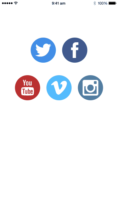
Add the following sample data as a read-only property to MenuViewController:
let items = [
    SocialItem(image: UIImage(named: "icon-twitter"), color: UIColor(red: 0.255, green: 0.557, blue: 0.910, alpha: 1), name: "Twitter", summary: "Twitter is an online social networking service that enables users to send and read short 140-character messages called \"tweets\"."),
    SocialItem(image: UIImage(named: "icon-facebook"), color: UIColor(red: 0.239, green: 0.353, blue: 0.588, alpha: 1), name: "Facebook", summary: "Facebook (formerly thefacebook) is an online social networking service headquartered in Menlo Park, California. Its name comes from a colloquialism for the directory given to students at some American universities."),
    SocialItem(image: UIImage(named: "icon-youtube"), color: UIColor(red: 0.729, green: 0.188, blue: 0.180, alpha: 1), name: "Youtube", summary: "YouTube is a video-sharing website headquartered in San Bruno, California. The service was created by three former PayPal employees in February 2005 and has been owned by Google since late 2006. The site allows users to upload, view, and share videos."),
    SocialItem(image: UIImage(named: "icon-vimeo"), color: UIColor(red: 0.329, green: 0.737, blue: 0.988, alpha: 1), name: "Vimeo", summary: "Vimeo is a U.S.-based video-sharing website on which users can upload, share and view videos. Vimeo was founded in November 2004 by Jake Lodwick and Zach Klein."),
    SocialItem(image: UIImage(named: "icon-instagram"), color: UIColor(red: 0.325, green: 0.498, blue: 0.635, alpha: 1), name: "Instagram", summary: "Instagram is an online mobile photo-sharing, video-sharing and social networking service that enables its users to take pictures and videos, and share them on a variety of social networking platforms, such as Facebook, Twitter, Tumblr and Flickr.")
]
Next we have to ensure our collection view cell is configured with the right model:
override func collectionView(collectionView: UICollectionView, cellForItemAtIndexPath indexPath: NSIndexPath) -> UICollectionViewCell {
    let cell = collectionView.dequeueReusableCellWithReuseIdentifier(reuseIdentifier, forIndexPath: indexPath) as SocialItemCell

    // Configure the cell
    var index = 0
    for s in 0..<indexPath.section {
        index += self.collectionView(collectionView, numberOfItemsInSection: s)
    }
    index += indexPath.item

    let item = items[index]
    cell.item = item

    return cell
}
We're simply computing an index into our array of sample items by counting all the items before the current item (including those in previous sections.) Then we retrieve the data model at this index from our items array and set it on our custom collection view cell.
Next we will expose a new property on DetailViewController:
var item: SocialItem?
We will also have DetailViewController configure itself on viewDidLoad():
override func viewDidLoad() {
    super.viewDidLoad()

    // Do any additional setup after loading the view.
    if let item = item {
        coloredView.backgroundColor = item.color
        imageView.image = item.image

        titleLabel.text = item.name
        summaryLabel.text = item.summary
    }
    else {
        coloredView.backgroundColor = UIColor.grayColor()
        imageView.image = nil

        titleLabel.text = nil
        summaryLabel.text = nil
    }
}
Now we can pass the model over from MenuViewController when the cell is tapped:
override func collectionView(collectionView: UICollectionView, didSelectItemAtIndexPath indexPath: NSIndexPath) {
    selectedIndexPath = indexPath

    var index = 0
    for s in 0..<indexPath.section {
        index += self.collectionView(collectionView, numberOfItemsInSection: s)
    }
    index += indexPath.item

    let item = items[index]
    let controller = UIStoryboard(name: "Main", bundle: nil).instantiateViewControllerWithIdentifier("DetailViewController") as DetailViewController
    controller.item = item

    navigationController?.pushViewController(controller, animated: true)
}
Build and run and you should see the following:
Polishing the Post-Transition
We're left with a couple of flourishes we can add to really make the transition pop. We're going to make the controls in the DetailViewController slide in from the edges, i.e. the back button from the top and the labels from the bottom.
One easy way to do this when we've configured the layout using Auto Layout is to create outlets for our constraints. With the constraint selected in Interface Builder, right-click and drag into Assistant Editor showing DetailViewController.swift:
@IBOutlet weak var backButtonTopConstraint: NSLayoutConstraint!
@IBOutlet weak var summaryLabelBottomConstraint: NSLayoutConstraint!
Next we will add a method to adjust parameters on the constraints:
func setupState(initial: Bool) {
    if initial {
        backButtonTopConstraint.constant = -64
        summaryLabelBottomConstraint.constant = -200
    }
    else {
        backButtonTopConstraint.constant = 0
        summaryLabelBottomConstraint.constant = 80
    }
    view.layoutIfNeeded()
}
We basically modify the constant parameters for the constraints then tell our view to layout itself out again.
Now we need to way to notify the view controller when it should perform the animations. We'll add an optional method to our ZoomingIconViewController protocol:
@objc
protocol ZoomingIconViewController {
    ...

    optional
    func zoomingIconTransition(transition: ZoomingIconTransition, willAnimateTransitionWithOperation operation: UINavigationControllerOperation, isForegroundViewController isForeground: Bool)
}
We need to modify our animateTransition() method to handle the notifications:
func animateTransition(transitionContext: UIViewControllerContextTransitioning) {
    ...

    // perform animation
    (backgroundViewController as? ZoomingIconViewController)?.zoomingIconTransition?(self, willAnimateTransitionWithOperation: operation, isForegroundViewController: false)
    (foregroundViewController as? ZoomingIconViewController)?.zoomingIconTransition?(self, willAnimateTransitionWithOperation: operation, isForegroundViewController: true)

    // need to layout now if we want the correct parameters for frame
    foregroundViewController.view.layoutIfNeeded()

    ...
}
We've used the Optional Binding operator in
zoomingIconTransition?()which will only call the method on the view controller if it has been implemented (as we declared this method optional in our protocol.)
Finally we'll implement this method in DetailViewController:
func zoomingIconTransition(transition: ZoomingIconTransition, willAnimateTransitionWithOperation operation: UINavigationControllerOperation, isForegroundViewController isForeground: Bool) {
    setupState(operation == .Push)

    UIView.animateWithDuration(0.6, delay: operation == .Push ? 0.2 : 0, usingSpringWithDamping: 1, initialSpringVelocity: 0, options: .allZeros, animations: { () -> Void in
        [self]
        self.setupState(operation == .Pop)
        }) { (finished) -> Void in
    }
}
We add a slight delay on the push transition so we can see the zooming effect happen first.
Now build and run and you should see the following:
Afterthoughts
That's it, we've created the Zooming Icons effect. You've learnt how to:
- Setup and implement the
UIViewControllerAnimatedTransitioningprotocol - Override transitions in
UINavigationControllerusing its delegate - Create a navigation controller transition that can be used generally by defining our own protocol
If you liked this teardown and want to receive updates on the book, subscribe to my mailing list (your email will not be shared):