My book on iOS interface design, Design Teardowns: Step-by-step iOS interface design walkthroughs is now available!
Offbeat: Playlists for Every Mood
I've recently released Offbeat, a music app that helps create playlists based on a given tempo. It's great for exploring your music but it's also a terrific design exercise.
Download it for free on the App Store
Design Decisions
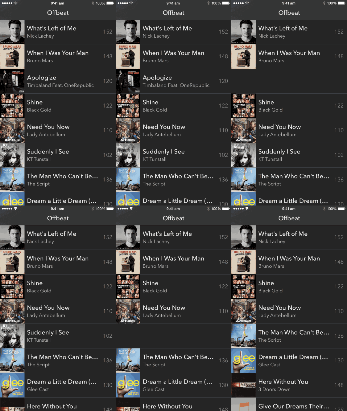
The screen is your playlist.
For Offbeat, I wanted an extremely simple UI where the screen is simply the playlist. Tap on an item to play.

Swipe an item to left or right to remove from the playlist.

A fun way to randomize a playlist.
Because the concept is rather simple, the most obvious way to select a tempo might be to use a slider:

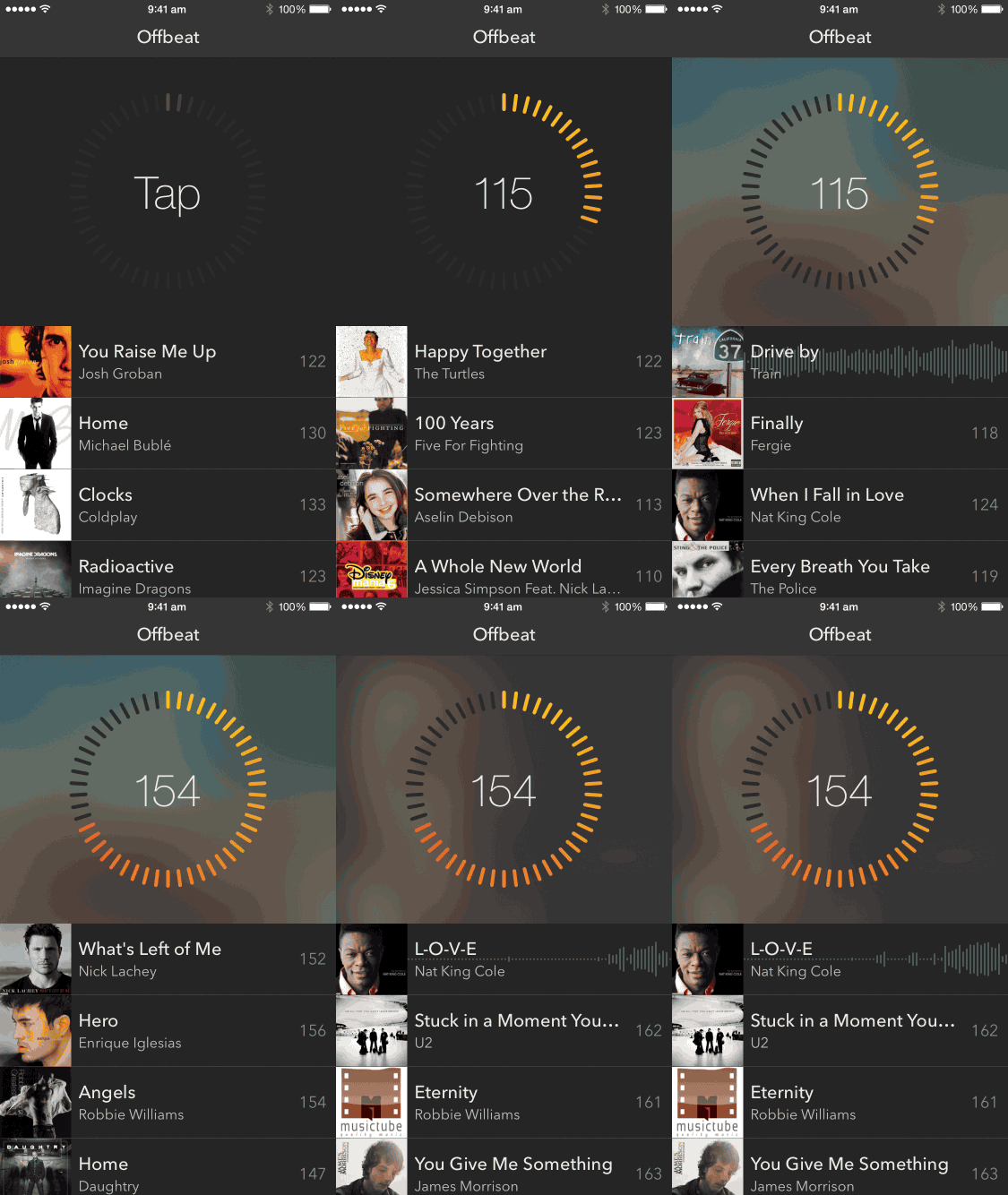
However, this probably might have been no fun at all and made for a poor user experience. Instead I opted to use color to give a sense of speed (magnitude of the tempo). The circular motion also might be familar to those who used the Click Wheel on the classic iPod.
Here's how you can scrub through to find a playlist with the right tempo:

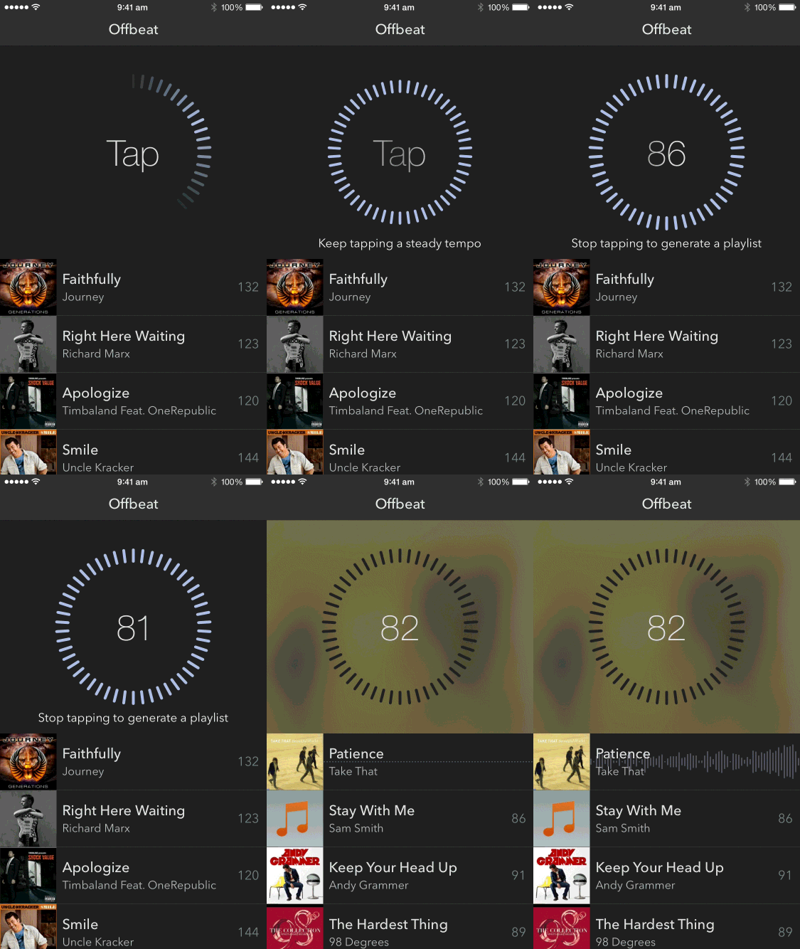
And to take the interactions up a notch, you can also start tapping on the scrubbing control (or Tempo Dial) to physically tell the app your preferred tempo:

Provide hints for new interactions.
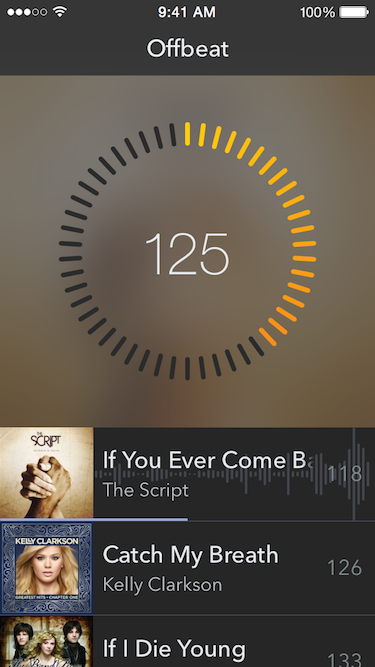
Because the Tempo Dial is something unfamiliar to users (they are not likely to have seen it before in other apps.) I decided to provide a fun-looking hint in the form a moving glow around the control to encourage the scrubbing interaction:

I also fade between the verbs "scrub" and "tap" to show the different interactions that are possible.
I hope you liked this short discussion. Let me know what you think in the comments.

